

Stay updated with our letter
Valuable perspectives on the latest trends and tips.
.avif)


8 Easy Steps For Designing A Website From Scratch | Beginner Guide
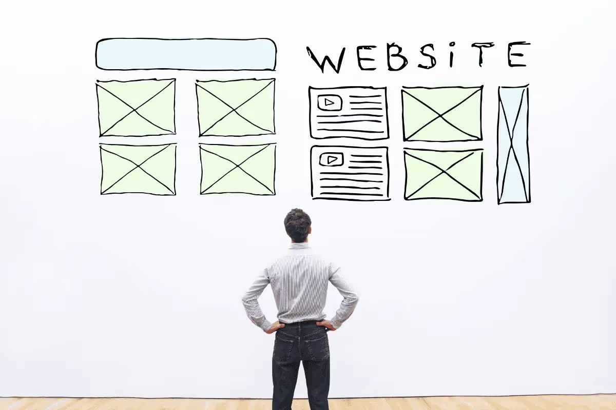


Building a website from scratch starts with deciding what it needs to do for the people who will use it. The platform, page layouts and visual details follow from that decision. Beginning with a clear purpose makes the later choices easier to assess.
You do not have to write every line of code yourself to create a considered website. A CMS, a hosted builder or a custom implementation can all be appropriate. The important work is connecting the content, design and functionality into a journey that makes sense.
These eight steps take a beginner from a first brief to a maintained site. The examples are hypothetical, and the guide does not promise a fixed budget, launch time or commercial result for every project.
1. Define the purpose and audience
Write down the main task the website should support. A service business may need suitable enquiries, a shop needs customers to evaluate and buy products, and a portfolio needs to explain the work and the person's role in it.
Make the intended call-to-action follow from that task. A visitor reading an introductory explanation may want more detail before booking a call. Someone who has already chosen a service may need a direct route to discussing the scope.
Describe the audience through its questions and circumstances. A first-time buyer may need an explanation of the process, while an experienced buyer may look for technical details and evidence. Avoid building the brief around a stereotype of an age group or profession.
Use existing enquiries, interviews or observed behaviour where available. If the business is new, separate what you know from what you assume. A small amount of direct feedback is often more useful than a detailed persona invented without evidence.
The link labelled financial advisor’s website leads to an accounting business reference. Study it as a service-site example rather than treating the label as evidence of a particular advisory authorisation. When using any reference, look at how the offer and contact route are explained.
Set a useful success measure. “People can identify the relevant service and submit an appropriate enquiry” is more actionable than “make the site impressive”. Commercial targets can be included, but they should reflect the business's actual circumstances rather than a number copied from a generic guide.
2. Establish ownership, hosting and support
Your domain is the address people use to reach the website. Choose it carefully, keep the registration details accurate and make sure the business knows who controls the account. A memorable address is useful, but account ownership matters long after the initial naming decision.
Compare the renewal cost and terms, not just a promotional first-year price. Record the renewal process and recovery contact. If someone else registers the domain on your behalf, agree how access and ownership will be handed over.
Hosting makes the site available online. Some platforms include it, while other arrangements require a separate service. Choose around the website's needs and the support the team can provide, rather than assume the cheapest or most expensive plan is automatically right.
HTTPS protects information in transit between the browser and the site. It is important, but it does not prove that every part of the website is secure. Account access, updates, integrations and data handling still need appropriate attention.
Clarify maintenance responsibilities before launch. Who handles software updates, broken functionality and recovery? Who updates content? A hosting subscription and an agency support arrangement may cover different work.
Keep a short ownership record covering the domain, platform, hosting and connected services. The business should be able to recover access and identify the responsible supplier without searching old messages or relying on a former employee.
3. Set a budget around the actual scope
A website budget should include the work needed to reach a usable result. Discovery, copy, design, implementation, image preparation, integrations, testing and handover may all contribute. Page count alone does not describe the effort.
A five-page site with a complex booking workflow can require more work than a larger site built from a small set of straightforward templates. Explain the required behaviour when asking for an estimate.
Separate one-off costs from recurring commitments. Platform fees, hosting, paid extensions and support can continue after the design project ends. Confirm what changes the cost as the site grows, such as additional users or features.
If building the site yourself, include your time. Learning a tool, preparing content and resolving an integration still require effort even when the software has a free starting plan. That does not make DIY a poor choice; it makes the comparison more realistic.
For a hypothetical service website, prioritise clear service pages, relevant evidence and a working enquiry route before commissioning optional interactions. A smaller coherent site is a stronger starting point than a large one with unfinished sections.
Keep a record of exclusions and assumptions. If copywriting or product entry is not included in the quoted scope, decide who will complete it and when. Unassigned work often becomes a launch delay.
4. Plan the content and structure together
List the essential pages and the question each answers. A homepage introduces the offer, service pages explain it in detail, project pages provide relevant evidence and a contact page supports the next conversation. The exact structure should follow the business.
Write a first content draft before approving detailed layouts. Real headings and paragraphs reveal how much space the explanation needs. Designing entirely with placeholder copy can produce a page that looks balanced but cannot accommodate the actual message.
Group related information and use recognisable labels. A visitor should not need to understand your internal department names to find a service. Keep navigation consistent, and make the relationship between an overview and a detailed page clear.
Plan repeating content in the CMS. Articles, projects and team profiles may benefit from structured records and templates. Decide which information is shared and which belongs to an individual page so future updates remain manageable.
Gather useful images alongside the copy. A photograph, screenshot or diagram should help explain the subject. Check rights, accuracy and quality, and plan suitable alternatives for information conveyed visually.
Read the proposed journey from the visitor's perspective. Can they understand the offer, assess relevant evidence and find the appropriate next step? If a page does not contribute, reconsider its purpose before adding it to the build.
5. Choose the implementation and delivery team
The platform should support the content and functionality you have identified. A hosted builder may suit a straightforward site, while another CMS or custom implementation may be justified by specific editing or integration needs.
These categories overlap. A builder can include a CMS, and a CMS can provide visual design tools. Avoid choosing through a rigid ladder in which every business is expected to graduate from a template to bespoke code.
If seeking a web design agency London, compare the proposed work and responsibilities. Ask who handles design, implementation, content and testing. Review relevant examples with a clear explanation of the supplier's contribution.
A freelancer and an agency can both be suitable. Assess skills, capacity, communication and continuity rather than assuming that one arrangement always produces better quality or a faster result.
Request a demonstration of ordinary editing. Can you change a service description, replace an image and add a project without disrupting the layout? The system should fit the tasks your team will own after launch.
Agree a review process with one clear decision-maker. Feedback is easier to act on when it identifies the problem and its context. “The service difference is unclear” is more useful than several conflicting instructions to move elements around.
6. Build search and accessibility foundations into the pages
Start with useful information that answers the intended audience's questions. Use descriptive page titles and a logical heading structure. Internal links should help readers move to relevant detail rather than repeat keywords without purpose.
Choose understandable URLs when creating new pages. For an existing site, preserve established addresses where practical instead of renaming them for appearance alone. Plan any necessary changes deliberately.
Audit tools, including Lookkle, can identify issues to investigate. A score is not a guarantee of search visibility. Review the actual finding and decide whether it affects the website's purpose or technical health.
Accessibility also needs attention throughout the build. Use meaningful headings, clear form labels and controls that work with a keyboard. Do not make essential information available only through colour, hover or animation.
Write image alternatives according to the image's purpose. An informative diagram needs a useful explanation, while purely decorative imagery may need an empty alternative. Repeating a target search phrase in every image description does not help the reader.
Check the site as content is added. A template that works well with a short title can fail with a longer one, and a table can become difficult to read on a phone. Real content is part of testing, not something added after the design is considered finished.

7. Test the complete journey before launch
Use cross-browser testing to check representative behaviour across the browsers and devices relevant to your audience. A resized desktop window can reveal layout issues, but it is not the same as testing the interaction on an actual phone.
Follow the main tasks from beginning to end. Submit the enquiry form with appropriate test data, confirm delivery and review the acknowledgement. For a store, test the order and operational handover through the approved test process.
Check error cases as well as successful ones. Required fields should be clear, invalid entries should receive helpful explanations and the visitor should not lose all their work because one value needs correction.
Performance tools such as Webpagetest can help identify loading problems. Review representative pages rather than only the homepage. Large media, unnecessary scripts and third-party embeds may affect the experience differently across the site.
Optimise images to suit their display and purpose. Lazy loading can help with images lower down a page, but delaying an important initial image can make the opening experience worse. Test the result rather than apply every optimisation indiscriminately.
Prepare the launch process. Confirm domain settings, production forms, access and any indexing controls used during development. Keep a recovery plan and someone available to investigate if an essential route does not behave as expected.
8. Maintain the site and build relevant traffic
A website needs a way for the right audience to find it. Choose marketing activity around the offer and the capacity of the business. Search, referrals, useful content, email and paid promotion can each have a role, but they require different work.
Connect each activity to a relevant destination. A campaign about one service should not send visitors to a page where that service is difficult to find. The message, page and next step should agree.
Define the outcomes you will review. Suitable enquiries, completed purchases or successful support tasks are more meaningful than a generic ambition to increase all traffic. Keep the measurement proportionate and respect the requirements for the data you use.
Assign routine maintenance. Review important information when it changes, check key functionality and keep account access current. The responsibility should be clear even if the site does not need frequent visual changes.
Use feedback to prioritise improvements. If visitors repeatedly ask the same question, the page may need a clearer explanation. If enquiries fail to reach the team, fix that route before increasing promotion.
A first release is a starting point. Keep a manageable list of observed issues and worthwhile next steps, then improve the site deliberately rather than add a new feature whenever a tool offers one.
What “from scratch” means with modern tools
A website can be designed around a business without rebuilding every technical component. Templates, platform features and established integrations can save work when they fit the requirements. Customisation should have a clear purpose.
An AI-assisted service such as CreateMyStore is one option to investigate for store creation. Review current terms and the generated result carefully. Claims such as “conversion-ready” or “winning products” do not establish that the store will suit your audience or produce sales.
Generated copy still needs verification, and product information needs a reliable source. Check images, policies, navigation and the order journey before considering a generated store ready for customers.
The same principle applies to custom code. Control over implementation does not guarantee performance, accessibility or maintainability. Those qualities come from the decisions and checks made throughout the project.
A worked example: a focused service website
Imagine a hypothetical local consultancy creating its first site. The team offers three related services and wants enquiries from businesses that understand the scope. It does not need a customer portal or an elaborate content library at launch.
The brief starts with a homepage, three service explanations, a small set of accurately described projects and a contact route. The copy explains who each service is for, what work is included and what information helps begin a discussion.
A shared service template keeps the design coherent, but the sections can accommodate different evidence. One service may use a process diagram, another a project photograph. The layout should not force every page to contain an invented testimonial or an unnecessary statistic.
The enquiry form asks for enough context to route the request and explains the next step. The team tests delivery, reviews the acknowledgement and assigns responsibility for replies. That operational detail is part of making the site useful.
After launch, the business reviews actual questions. If visitors confuse two services, the next improvement may be a clearer comparison. If the right visitors rarely reach a service page, the team can investigate navigation and distribution. The decision follows evidence rather than a fixed redesign calendar.
Prepare the first content pack before detailed design
A useful content pack does not need to be elaborate. Gather the current service descriptions, contact information, approved project material and available images. Identify which information is confirmed and which still needs a decision.
For each service, explain the problem it addresses, who it is intended for and what the business actually delivers. Include boundaries that help a prospective customer judge fit. A clear account of what is excluded can prevent unsuitable enquiries and make the offer easier to trust.
Choose evidence that supports the explanation. A project can describe the brief, the work and the result without inventing a dramatic metric. If the work was a concept or a collaboration, label it accurately and explain the contribution.
Check image files before the design relies on them. A small image copied from a social profile may not work as a wide page feature. A photograph may contain information that needs permission to share. Resolving those questions early avoids replacing important material at the last moment.
Keep the pack organised by page or content type and identify the final approved version. When several people edit different copies, the designer can end up working from obsolete wording. A simple shared source helps the project move forward coherently.
Make feedback specific enough to improve the page
Describe the issue and its context. “The heading and image suggest different services” identifies a problem. “Make it pop” does not explain what the visitor needs. The designer can propose a better solution when the underlying concern is clear.
Consolidate feedback before sending it. If one reviewer wants a shorter explanation and another needs more detail, resolve the audience and purpose first. Otherwise, the page can alternate between incompatible directions without becoming more useful.
Review the revised version against the original concern. A change may solve one problem while affecting another part of the layout or message. Check the whole section, including its mobile reading order, before considering the issue resolved.
Keep a small decision record for choices that affect the rest of the site. An agreed heading style, image treatment or button label can then be applied consistently. That consistency saves repeated discussion and helps the final website feel considered.
Agree what approval means at each review. Approving a visual direction is different from confirming that final copy and functionality are ready for launch. Clear stages help everyone understand which questions remain open and avoid mistaking an attractive draft for a fully checked website.
Common decisions that deserve a second look
Be cautious when a project begins with a long list of features but no clear audience task. Each feature needs content, implementation and maintenance. Removing an unnecessary interaction can make the site easier to use and support.
Do not postpone all content until the end. Unfinished copy and missing images affect layout, testing and approval. Give the content work an owner and include it in the schedule.
Avoid assuming that hiring a professional guarantees rankings or conversions. A good supplier should explain the work, the evidence and the limits of what can be promised. Ask how the result will be tested and maintained.
Keep the business in control of essential accounts and information. A finished website is less useful if the team cannot update it, recover access or understand who handles a problem.
For Fit Design, the strongest starting point is a brief that connects the desired visual direction to those practical needs. The aim is a clear website that helps people understand the business and gives the team a workable way to maintain it.
Primary references: Google's SEO starter guide, web.dev guidance on image performance and W3C accessibility tutorials. Use current platform documentation for the implementation you choose.
Yes. Start with a small complete project and learn the content, layout and testing tasks involved. Use feedback to improve the result and seek specialist help where the requirements exceed your current skills.
Some tools offer free starting options, but check their current limits and terms. A business site may also need a domain, paid features and ongoing support. Include your time when comparing the full cost.
Not for every website. Visual tools can handle many ordinary tasks, but the site still needs clear content, responsive behaviour and testing. Custom functionality may require technical expertise.
No. A capable team can implement useful foundations, but rankings depend on multiple factors. Ask what work is included and how it will be checked rather than accept a guaranteed result.
The agreed working site, account responsibilities and practical guidance for routine updates. Clarify support, access recovery and the ownership of content, code and connected services.


.webp)
Where ideas come to life
We explore various aspects of modern life, offering valuable perspectives on the latest trends, and helpful tips.

