

Stay updated with our letter
Valuable perspectives on the latest trends and tips.
.avif)


What's Typography in Web Design | Types | Beginners Guide



Typography is the way a website turns written content into something people can read, navigate and understand. The typeface matters, but so do size, line length, spacing, weight and contrast. A distinctive font cannot compensate for cramped paragraphs or headings that compete for attention.
For a business website, the aim is to make the message easy to follow while expressing the right character. A visitor should recognise what matters, find the relevant detail and understand the next step. Good typography supports those tasks throughout the site, from the first headline to the smallest form instruction.
Start with the job of the text
A headline introduces an idea. A paragraph develops it. A button describes an action. A caption explains an image. These roles need different treatment, but they should still feel related. Designing each element independently can produce a collection of attractive fragments without a readable page.
Begin with real content and identify its hierarchy before choosing sizes. The most important heading is not automatically the longest or loudest piece of text. A service page may need a calm, direct introduction followed by evidence; an editorial feature may need room for a more expressive title. The treatment should follow the reading task.
Consider the person using the page as well. Someone researching a technical service may read several paragraphs carefully, while another visitor is scanning for a contact route. A good system supports both without reducing every explanation to bullets or making all text equally prominent.
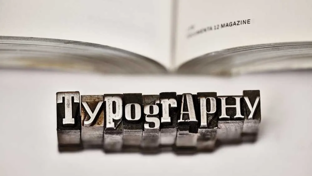
Understand the main typeface categories
Serif typefaces have finishing strokes attached to parts of the letterforms. Times New Roman is a familiar example. Sans-serif typefaces omit those strokes. Neither category is automatically more readable on every screen: the particular design, size, rendering and reading conditions all matter.
Display typefaces are intended to make a stronger visual impression, often at larger sizes. They can work well in a short title but become tiring in a long paragraph. A face such as Comic Sans has a recognisable informal character; whether that character fits the brand is a separate question from whether the font file loads correctly.
A typeface family may contain several weights and styles. Helvetica Neue is an example of a family name, while a specific regular or bold face provides a particular treatment within it. In everyday conversation, “font” is often used for both. For implementation, be precise about the actual files and styles being supplied.
Do not choose a category solely because a sector is said to require it. A law firm does not have to use a traditional serif, and a technology company does not have to use a geometric sans-serif. Review the firm's identity, audience and content, then test actual words rather than relying on a stereotype.
Build a system with fewer, stronger decisions
One well-chosen family can support an entire website through variations in size, weight and spacing. A second family may add a useful contrast, but it should have a defined role. Introducing another font whenever a section feels weak often hides a hierarchy or content problem rather than solving it.
Set the recurring roles in CSS and in the design system: page title, section heading, supporting heading, body copy, label and caption. Use consistent styles so editors do not have to make a fresh typographic decision for every block. A reusable system should make good choices easier to maintain.
If the design uses the Montserrat typeface , identify the required weights, character coverage and licensing terms. Provide an appropriate fallback such as Arial within a suitable font stack, then test what happens before the custom face is available. A fallback that occupies very different space can change line breaks and move nearby content.
Pairing a serif such as PT Serif with a sans-serif is one possible approach, not a rule. The two faces should have compatible proportions and a clear relationship. If they look nearly identical, the second family may add little. If they fight for attention, the contrast may be too strong for the content.
Set body text before designing dramatic headings
The body style carries most of an article or service explanation, so establish it first. For this kind of editorial website, a starting point around 18–20 pixels can be useful, adjusted for the chosen face and context. A font with a small apparent letter height may need a different size from another at the same numeric setting.
Choose a line length that lets the eye return comfortably to the next line. A very wide paragraph can be difficult to track, while a narrow column forces frequent returns and creates a tall wall of text. Test complete paragraphs in the intended layout rather than selecting a width from a single attractive sentence.
Line height should give the letters enough separation without making a paragraph fall apart. Start with a proportion that suits the typeface, then inspect dense passages, links and emphasis. The right relationship changes with size and measure; copying one line-height value to every heading and body style is rarely convincing.
Paragraph spacing should make changes of idea visible. It should not be so large that related sentences appear disconnected. Read the page from top to bottom and check the rhythm between paragraphs, headings, lists and images. The result should feel like one explanation rather than a series of unrelated blocks.
Create hierarchy without making everything enormous
A strong heading system uses a clear difference between levels. Size contributes, but so do weight and the space around the heading. A section title often needs more space above it than below, because it introduces the content that follows. This simple relationship can improve scanning without adding boxes or decorative graphics.
Preserve meaningful heading levels in the HTML. Choose an element because of its role in the document, then style it appropriately. Do not use a heading merely to make a sentence larger, or choose a lower-level heading only because its default size happens to look right.
Long titles are the real test. Check a heading containing several lines, a company name and a linked phrase. Avoid manual line breaks used solely to perfect one desktop screenshot: they may create awkward fragments at another width. Where a break is editorially intentional, verify that it still works across the relevant layouts.
Type hierarchy · illustrative example
Make the message easy to follow.
A clear heading introduces one idea. Comfortable body text gives the explanation enough room to develop.
One family · distinct roles · consistent spacing
Make emphasis selective
Bold text helps a reader locate a decision or important qualification. If half the paragraph is bold, that contrast stops doing useful work. Emphasise the phrase that carries the point and let the explanation around it remain calm. The same principle applies to colour and uppercase labels.
Links need to be recognisable within a sentence. An underline can make them distinguishable without relying only on colour, and a visible focus state helps keyboard users identify the active link. Test visited, hover and focus treatments against the actual background, rather than designing only the default state.
Good typography also distinguishes meaning from decoration. A quotation should be a real quotation or clearly labelled commentary. A large highlighted sentence should earn its prominence by helping the reader, not by repeating a point already made immediately above it.
Contrast and accessibility belong in the design
Choose foreground and background colours together. Thin grey text can look elegant in a design file but become difficult to read on a different display or in bright surroundings. Text over photography needs reliable contrast across the area behind every line, not just at one convenient point in the image.
WCAG's minimum contrast criterion generally requires a ratio of 4.5:1 for normal text and 3:1 for large text, with defined exceptions. Check the criterion's definition of large text rather than assuming a heading qualifies. Contrast measurements are part of the review; they do not establish that the entire page is accessible.
Test enlarged text and user-adjusted spacing. Content should remain available, controls should remain usable and containers should not crop the words. Fixed-height cards and tightly constrained buttons are common places for problems to appear. Allow the layout to grow with the content instead of shrinking the text to preserve a composition.
Adapt the reading experience for mobile
Mobile typography needs deliberate adjustment, not simply smaller versions of every desktop style. A large display headline may need a restrained scale, while body copy should remain comfortable. Check how many lines the title occupies and whether the opening explanation appears before the reader loses context.
Long tables should not force tiny text across the whole phone screen. Use a contained scrolling region or rethink the comparison when appropriate. Short labels may wrap; that is usually preferable to truncating important meaning. Test the interaction as well as the appearance.
Navigation, form fields and validation messages deserve the same care as article copy. A decorative face that works in a title may be unsuitable for a postcode, email address or account reference. Check letters and numerals that can be confused with one another, especially where accurate entry matters.

Account for the content your editors will publish
A typography system should survive beyond the launch copy. Try a long staff name, a case-study title with punctuation, a two-line button label and a paragraph containing several links. If every unusual example needs a manual override, the system is too fragile.
Check the characters your languages require. A font can look complete in an English mockup yet lack suitable accented characters elsewhere. Inspect quotation marks, currency signs and numerals too. The visual identity should remain coherent when real business content replaces the demonstration text.
Give editors guidance about emphasis and headings. Explain when to use a subheading, when a list is useful and why pasting formatted text from another document can introduce inconsistent styling. A small set of clear conventions is easier to follow than a long style guide nobody uses.
Balance font delivery with visual quality
Every font file is another resource the site may need to download. Use the weights and styles that the design actually requires. Check the licence before hosting, modifying or subsetting files, and verify that the implementation includes the characters needed by the content.
Font-loading behaviour affects what the visitor sees before the chosen face is ready. Inspect a slower connection and watch for invisible text, disruptive changes in line breaks or delayed controls. The goal is readable content throughout loading, with a transition that does not destabilise the page.
Performance should not become an excuse to use inappropriate typography, just as visual ambition should not justify loading every available weight. Make the trade-off deliberately. Often a disciplined family selection and a smaller set of styles can support both a distinctive identity and an efficient implementation.
Review the page as a reader
A useful typography review starts by reading the actual content. Can you follow the argument? Do headings signal the next subject? Are important qualifications legible? Does an image interrupt a paragraph at the wrong point? These questions expose problems that are easy to overlook while adjusting individual font settings.
For a Fit Design project, the practical deliverable should include reusable type styles and examples in real page layouts. Review a service page, a case study, an article and a form. They share the same identity but have different reading tasks, so the system needs enough flexibility to support each without becoming inconsistent.
Test at desktop, tablet and phone widths, then enlarge the text and navigate with a keyboard. Check the final browser rendering, because design files do not reproduce every platform's font behaviour. Record the decisions in the style guide so later changes have a clear reference.
Excellent typography is usually felt before it is noticed. It lets the reader understand the message without negotiating the layout. A recognisable typeface can give a site personality, but consistent hierarchy, comfortable reading and careful implementation are what make that personality useful.
Reference: W3C's WCAG reference covers contrast, text resizing and text-spacing requirements.
One or two can be enough. Give each family a defined role and use size, weight and spacing to establish hierarchy before adding more fonts.
Choose a comfortable size for the typeface, reading width and audience. Around 18–20 pixels can be a useful starting point for editorial content, but test the actual browser rendering and enlarged text.
No. Uppercase can work for short labels, but longer headings often read more comfortably in normal case. Check line breaks and spacing in the real layout.
Check the licence, required characters, available styles and delivery method. Provide suitable fallbacks and test loading behaviour on a slower connection.
Use real content across screen widths, enlarge the text and check contrast, spacing, focus states and clipping. Review forms and navigation as well as headings and paragraphs.



.webp)
Where ideas come to life
We explore various aspects of modern life, offering valuable perspectives on the latest trends, and helpful tips.

