

Stay updated with our letter
Valuable perspectives on the latest trends and tips.


Beyond the AI template: how to make your website recognisable
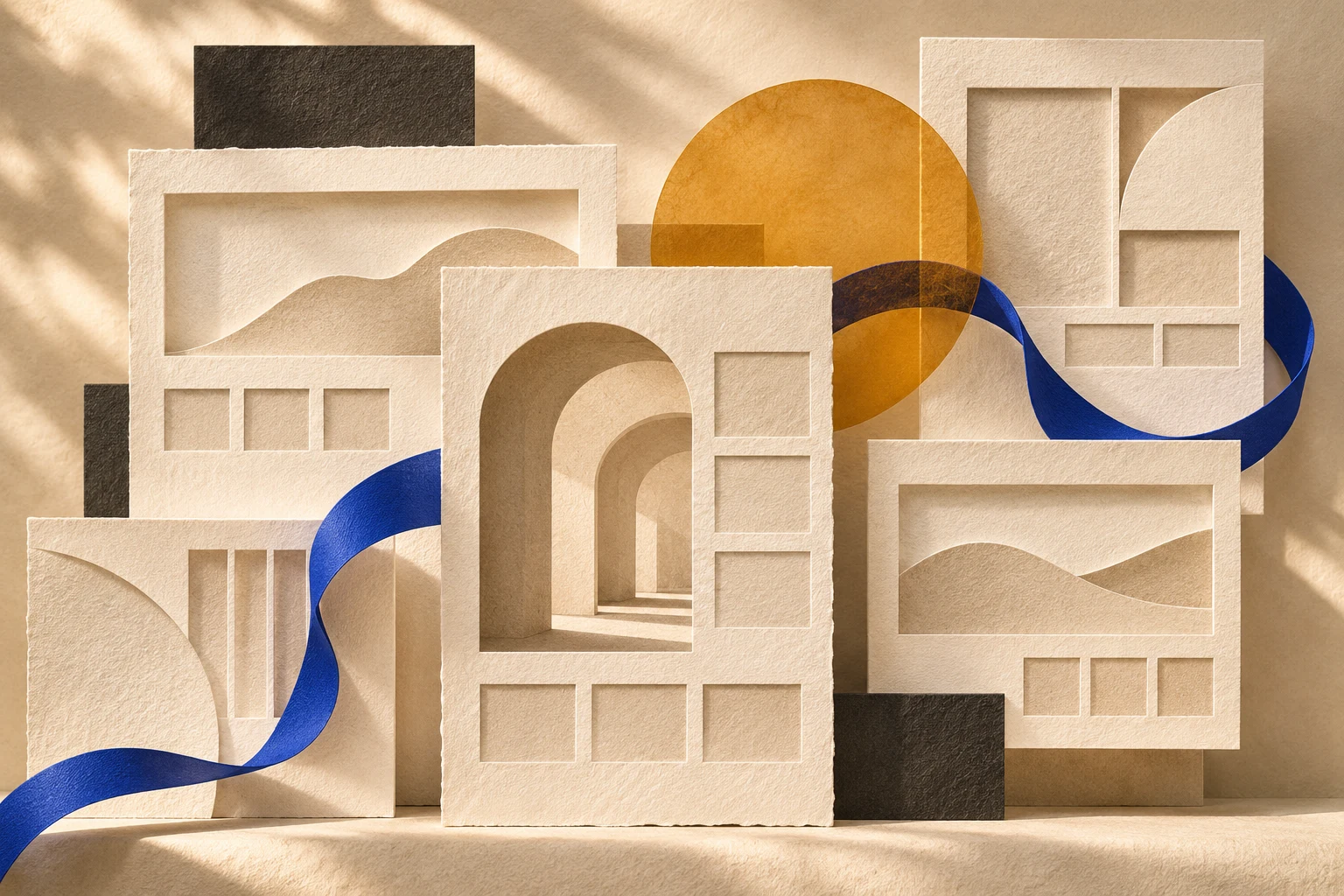


The response to generic website design is not more decoration. It is a visual language that belongs to your business and survives beyond the homepage.
Open a few websites in the same industry and you may notice a familiar rhythm: large promise, soft gradient, rounded service cards, logo strip, testimonial, contact form. None of those ingredients is automatically wrong. The problem starts when the whole composition could move to another business without anyone noticing.
This is not exclusively an AI problem. Templates, shared references and conservative approval processes produced similar-looking websites long before generative tools became common. AI adds another convenient route to a plausible first draft. Whether that draft becomes something distinctive depends on what happens next.
Webflow's 2026 trend report discusses custom visual treatments, the combination of art and interface design, and more concise copy. Creative Bloq's coverage of 2026 graphic design also identifies renewed interest in texture and human craft. These are editorial observations, not proof that one aesthetic will improve every website. They are useful because they point towards the same question: what gives this particular brand a recognisable presence? [1][2]
For a London business planning a redesign, that question is more valuable than a shopping list of fashionable effects. A boutique consultancy, a furniture maker and a recruitment company do not need the same answer. They need a way to make their own character visible without making the site harder to use.
Begin with something the business can actually own
Distinctiveness is often confused with novelty. An unusual cursor may be memorable for a moment, but it does not necessarily explain the business. A recognisable visual language comes from choices that can recur meaningfully: a way of framing work, a particular rhythm of type, an illustration approach or a consistent use of materials and colour.
Start with the evidence available to you. What does the team make? How does it work? Which details do customers notice? An architecture practice might have a rich archive of sketches and construction photographs. A specialist consultancy might have a clear method for making difficult decisions. A manufacturer might have beautiful material details that its current website barely shows.
Those assets give a designer something more specific than “modern and premium”. They also create a useful constraint. If the proposed direction could only be maintained with an expensive new shoot every month, it may not suit the business. The best system is one you can continue producing, not just admire at launch.
Local character can help when it is genuine. For a London studio, its buildings, workshops or working environment may supply relevant imagery. There is no obligation to use landmarks. A close photograph of the actual work can say more than a generic city panorama that every competitor can buy.
Direction one: show the material behind the service
Texture works best when it belongs to the subject. Paper, fabric, pencil marks and natural surfaces can suggest care and physicality, but adding grain to an unrelated background does not automatically make a brand feel human.
Consider a hypothetical London interiors practice specialising in adapting older homes. Instead of filling the site with interchangeable luxury-room imagery, it could use detail photographs of joinery, annotated plans and paired views of a room during and after work. The design would make attention to existing materials part of the story.
That direction needs editorial discipline. Each image should explain something: a junction, a spatial decision, a constraint or a finished detail. A large texture photograph can provide a pause in the reading rhythm, but it should not be the only evidence of expertise. Actual project photographs and clear captions still do the harder work.
AI-generated imagery can be useful for abstract editorial concepts, as it is for this article's cover. It should not impersonate a finished commission. If an image looks like a portfolio photograph, a visitor may reasonably assume it documents real work. Use genuine work to demonstrate experience and label conceptual imagery where its status could be misunderstood.
Direction two: let typography carry a clear point of view
Typography can give a site personality without adding another graphic element. The relationship between headline, explanation, caption and navigation often matters more than choosing an unusual typeface.
A confident heading needs a useful message. Enlarging “We build better futures” may create visual impact, but it does not tell a buyer what the company does. A more specific sentence gives the design something to organise. Once the words are right, the designer can decide where to create emphasis and where to let the page breathe.
The system must also survive real content. Test a short project title and a long one, a number-heavy case study and a text-heavy service page. If there are several languages, test those languages before approving fixed-width buttons or carefully arranged headline breaks. Translation is part of the layout, not a content replacement performed at the end.
Restraint is useful here. A distinctive display style can coexist with very ordinary, readable body text. You do not need every label to perform. Leaving some elements quiet helps the important ones carry more weight and makes a long article easier to read.
We create exceptional spaces.
London’s older homes.
Interior design that works with the building’s existing character, from spatial planning to finishing details.
Direction three: create one repeatable visual idea
A custom visual idea should connect pages rather than decorate them independently. It might be a framing device for project images, an illustrated vocabulary for services or a consistent way of revealing information. Its strength comes from repetition with variation.
Imagine a hypothetical advisory business whose work is about making hidden relationships visible. Its visual system could use a restrained line that connects related information in diagrams and selected page transitions. The idea would have a reason to exist. Adding unrelated floating shapes to every section would weaken that connection.
A practical test is to apply the idea to three different contexts: the homepage, a service page and a detailed case study. If it only works in the hero, it is probably an effect rather than a system. If it overwhelms every page, it needs less exposure. A recognisable identity should still leave room for different kinds of content.
Motion can support the idea, but the page should remain understandable without it. A reveal might help explain a sequence; movement that delays access to the main message adds a cost. W3C's guidance on animation from interactions is a useful reference when planning alternatives for people who need less motion. [3]
Direction four: replace generic imagery with a visual argument
An image earns its space when it helps a visitor understand something the text cannot communicate as efficiently. That might be the scale of an object, the feeling of a space or the relationship between stages of a process. “We need an image on the right” is not a sufficient brief.
For a professional-services business, this can be challenging because the product is often intangible. The answer does not have to be stock photography of people in meetings. A carefully edited project document, a clear diagram or a photograph of a real workshop can make the thinking tangible, provided permissions and sensitive details are handled properly.
The image and the surrounding copy should work together. If a caption merely says “our process”, it misses an opportunity. Explain the detail worth noticing. If the text already describes everything the image shows, consider whether the visual adds anything or whether a different example would carry more information.
This is where art direction becomes valuable. It turns a set of unrelated assets into a consistent editorial approach. The site starts to have a point of view because someone has selected what to show, what to leave out and how the visitor should encounter it.
What should stay familiar
Distinctive design does not require unfamiliar navigation. People should be able to recognise a link, understand a menu and use a form without decoding the brand's personality first. The expressive layer belongs around a dependable interaction structure.
Keep essential labels clear. A poetic title may work for a campaign, but a service navigation item should still help someone find the service. Make contact routes visible. Avoid relying on hover to reveal information that a touch-screen visitor needs. Test the page with a keyboard rather than assuming a beautiful desktop composition is usable.
This is especially relevant when borrowing from award-site references. You may be looking at a short campaign built to create an impression, while your own site must support years of publishing and routine updates. The reference can inspire the visual direction without becoming a complete specification for how your website behaves.
Our existing guide to web design trends covers a broader range of techniques. The purpose here is narrower: choose a small number that express one coherent idea, then make sure they survive actual use.
Review the system before approving the homepage
A homepage can make almost any direction look convincing. Ask to see an ordinary content page too. Use real copy, a less spectacular image and a longer title. This is where you discover whether the design is robust or depends on unusually flattering sample content.
Review it at phone size and with enlarged text. Check whether the main message remains clear, whether captions can be read and whether the visual idea still makes sense when sections stack. A mobile version should feel deliberately composed, not like a desktop poster folded into a narrow column.
Then ask the person who will update the site to try the system. Can they select a suitable photograph using the guidance? Can they add a project without inventing a new layout? Can they identify when an animation is appropriate? Good handover materials turn a strong launch into an identity the team can maintain.
You can also test recognition informally. Show a few pages without the logo and ask what feels consistent. This is not a scientific measurement of brand recall. It is a useful conversation that can expose a system relying entirely on one colour or a logo in the corner.
Give the redesign one clear creative brief
Before commissioning another set of concepts, write a short explanation of what the site should make people understand and feel. Include the audience, the offer, the evidence available and the practical constraints. Bring a few references, but explain what you value in each one.
“We like this because it makes technical work approachable” is more useful than “make ours like this”. It gives a designer permission to solve the same communication problem differently. It also helps the team reject an attractive direction that does not fit the business.
At Fit Design, we connect that direction with the content and implementation needed to sustain it. If you are planning a website project in London, start with what makes your business worth recognising. The most useful design trend is the one you can turn into something specific, credible and recognisably yours.
Sources and editorial scope
Researched on 11 November 2026. The four directions are Fit Design's practical interpretation, not a reproduction of a trend ranking. All business scenarios and the typography demonstration are hypothetical. The cover is an AI-generated conceptual illustration.

Where ideas come to life
We explore various aspects of modern life, offering valuable perspectives on the latest trends, and helpful tips.

