


As a web designer, I’ve lost count of how many times I’ve heard this from B2B to eCommerce: “Traffic’s fine, but no one’s buying or booking or enquiring.” Most of the time, it’s not your offer - it’s friction. Tiny bits of confusion, delay, doubt, or effort that quietly push people back to Google or into a competitor’s checkout.
What are the 15 web design mistakes to avoid that leak revenue? Explore our practical fixes - whether you're just starting or have already built several sites. We've included real examples from our agency case studies to help you spot the patterns quickly.
List of Web Design Mistakes to Avoid
- Slow loading pages
- Vague headline / hero
- Too many choices in navigation
- Weak CTAs
- Forms that ask for too much
- Missing trust signals
- Friction in checkout
- Poor mobile experience
- Jumpy layouts (CLS)
- Accessibility issues
- Overdone animations
- Stock photos + custom emojis used as decoration
- Confusing pricing
- Pushy UX / dark patterns
- No tracking or funnel measurement
⚠️ 1) Slow Pages That Feel “heavy”

Your site looks premium, but it loads like it’s dragging a suitcase up Oxford Street. It gives the impression of your business that is outdated, unprofessional, and unreliable - turning potential customers away before they even see what you offer.
Usually caused by:
- Not compressed hero images or videos
- Too many third-party scripts (tracking, chat, popups, widgets)
- Heavy animations that block interaction
- Poor image formats or no compression
Why does it cost you sales/conversion?
People don’t “wait politely” for max 5s and they bounce. The ones who stay tend to browse less and convert less. Many studies and industry roundups consistently show meaningful drop-offs with even small delays.
EXAMPLE:
Baymard’s checkout benchmark shows most major eCommerce sites still perform mediocre or worse in checkout UX and performance issues are a frequent contributor to “this feels hard” moments.
How to fix it?
- Compress all images; serve WebP/AVIF for modern browsers
- Replace autoplay hero videos with a poster image + click-to-play
- Remove non-essential scripts (or load them after consent / after interaction)
- Track Core Web Vitals (LCP, CLS, INP) and optimise for real-user performance
Beginner Tip:
If you want to do only one thing, compress the hero image and remove the autoplay video. That alone often makes the site feel twice as “fast”.
Intermediate Tip:
Use real-user monitoring tools to find which pages and devices are actually slow. Lab tests don’t tell the full story.
⚠️ 2. Homepage Doesn’t Explain What You Do

It looks nice, but it doesn’t answer the visitor’s instant question: “Is this for me?” or "What is this website?" This is one of the most common mistakes we see - the message is pretty, but unclear.
Usually caused by:
- Generic headlines (“We build the future”, “Solutions that scale”)
- No clear service + audience + outcome
- Hero visuals that distract from the message
- No proof near the top of the page
Why does it cost you sales/conversion?
Confusion creates hesitation. Hesitation makes people bounce or keep shopping around. In a browser window, you’ve got seconds to communicate value before they hit back.
EXAMPLE:
For an accounting firm in London, we swapped a vague hero copy, "Accountants in London for Tax Solutions, VAT, Tax Audit & Bookkeeping Services" for a clear one-liner "Helping Small Businesses Pay the Right Tax - not MORE". Enquiries increased without any traffic change.
How to fix it?
- Write a one-liner: what you do + who it’s for + outcome
- Add one proof point near the hero (logos, reviews, results)
- Use one primary CTA and one secondary CTA max
- Remove any hero clutter that competes with the message
Beginner Tip:
If a stranger can’t describe what you do after 3 seconds on your page, your hero is failing.
Intermediate Tip:
Test three hero variants: outcome-led, problem-led and credibility-led - then compare CTA clicks and scroll depth.
⚠️ 3. Too Many Choices in Navigation
Your menu reads as a sitemap that freezes users without a clear structure or layout.
Usually caused by:
- 8–12 top-level nav items
- Multiple dropdown levels
- Internal naming instead of user language
- Repeated links in multiple places
Why does it cost you sales/conversion?
Choice overload increases mental effort. People don’t explore - they abandon as they're looking for simplicity and the quickest way to their information source, often found in bullet points.
EXAMPLE:
At one of the eCommerce sites we manage, we reduced the navigation to 6 core collections from 14 and we saw more product views per session and more checkout starts.
How to fix it?
- Keep top navigation to 4 - 6 items
- Use clear labels (Shop, Pricing, Services, Work, About, Contact)
- Make the revenue page easy to find (Shop/Pricing/Book)
- Add search functionality if you have lots of products/content
- Use internal linking to key pages
Beginner Tip:
If you wouldn’t fit it in a mobile menu cleanly, it’s too much.
Intermediate Tip:
Use analytics to identify your top 5 pages by conversion contribution, then build nav around those.
⚠️ 4. Weak CTAs That Don’t Tell People What Happens Next
Buttons look “clean” but don’t reduce uncertainty. Often, it's difficult to find the appropriate action to finalise the conversion. Eg. On a sales page, a vague call-to-action basically tells the user: ‘figure it out yourself.
Usually caused by:
- Generic CTAs (“Learn more”, “Get started”, “Submit”)
- Multiple CTAs competing on the same screen
- No reassurance near forms (response times, privacy, no obligation)
Why does it cost you sales/conversion?
People always avoid hidden effort. If they don’t know what happens next, they tend to delay their action or not convert at all.
EXAMPLE:
A “Submit” button changed to “Get a fixed quote (reply in 24h)” increased form completions with no design changes.
How to fix it?
- Use specific CTAs: “See pricing”, “Book a 15-min call”, “Get a quote”
- Add reassurance microcopy under the CTA
- Use one primary CTA per section
- Place CTAs at natural decision points, not randomly
Beginner Tip:
Every CTA should explain the next step in plain English.
Intermediate Tip:
Track CTA click-to-completion rate (clicks vs actual submissions) to spot false intent.
⚠️ 5. Forms That Ask for Too Much - Too Early

Your contact form feels like an interrogation section rather than getting the warm lead under your belt asap and converting them later.
Usually caused by:
- Too many required fields
- Forced phone number
- Dropdown lists and multi-selects
- No inline validation or clear errors
Why does it cost you sales/conversion?
Every extra field adds friction. Friction kills completions.
EXAMPLE:
We cut a business form from 11 fields to 4 and moved the rest to step 2. Lead volume increased and lead quality stayed stable.
How to fix it?
- Ask only for what you need to respond: name, email, message
- Make phone optional unless it’s essential
- Use a two-step form for complex enquiries
- Add clear inline errors and hints
Beginner Tip:
If you wouldn’t fill it in yourself on your phone, it’s too long.
Intermediate Tip:
Use form analytics to identify which field triggers the highest abandonment.
⚠️ 6. Missing Trust Signals Where People Decide
You’re asking for money or contact details without proving you’re legit, especially at CTA sections.
Usually caused by:
- Testimonials are hidden on a separate page
- No case studies or proof "badges" on the money page
- No clear returns, delivery, guarantees or policies
- No address/service area or team presence
Why does it cost you sales/conversion?
People don’t buy when they’re uncertain. Trust is a conversion requirement.
EXAMPLE:
To a cybersecurity site, we added a loop of logo and badges beside the main CTA and saw a noticeable uplift in booked calls from 0 to 3/4 per month.
How to fix it?
- Put proof near decision points (pricing, checkout, forms)
- Use specific testimonials (result + context)
- Add clear policy blocks (delivery, returns, warranty, response times)
- Show real-world presence (team, location, registrations where relevant)
- Link your privacy policy near forms and checkout to reduce hesitation
Beginner Tip:
One credible proof block near the CTA beats a “logos wall” nobody reads.
Intermediate Tip:
Use objection-based proof: each testimonial should answer a common worry (quality, speed, reliability, support).
⚠️ 7. Pricing That’s Hidden or Confusing
People can’t tell if they can afford you or not - so they most likely leave if they don't find the information. Give a hint and avoid unproductive calls.
Usually caused by:
- No pricing page at all
- “Contact us for pricing” - no guidance kills your conversions
- No starting price, packages, or ranges
- Features listed but no outcomes or who it’s for
Why does it cost you sales/conversion?
Users don’t want to waste time. If they can’t estimate cost quickly, they bounce, leading to significant drop-offs in search results.
EXAMPLE:
Our London agency introduced “starting from” pricing, along with three package tiers, and reduced low-quality enquiries while increasing qualified leads.
How to fix it?
- Add a “starting from” range if you can’t show exact pricing
- Use packages tied to outcomes, not just features
- Add “best for” labels per tier
- Explain what’s included and what’s not
Beginner Tip:
If you can’t publish exact prices, consider publishing ranges and a timeline instead for clarity.
Intermediate Tip:
Add a pricing qualifier (budget, timeline, goals) before the form to filter and pre-sell.
⚠️ 8. Checkout Friction That Makes Buying Feel Hard
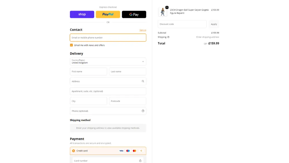
Customers want to pay, but your checkout makes them work for it way too much.
Usually caused by:
- No guest checkout
- Too many steps/fields
- Hidden fees until the last screen
- Unclear delivery dates and returns
- Weak payment options
Why does it cost you sales/conversion?
Checkout is where intent is highest and patience is lowest - remember.
EXAMPLE:
Baymard’s research shows many leading sites still have major checkout UX issues that contribute to abandonment.
How to fix it?
- Offer guest checkout
- Show total cost early (including delivery - start from or UK based)
- Add delivery estimates before payment
- Offer fast payment methods (Apple Pay/Google Pay)
- Remove distractions during checkout
Beginner Tip:
Don’t surprise users with shipping costs late - that’s where carts die.
Intermediate Tip:
Track checkout step drop-off and fix the step with the highest exit first.
⚠️ 9. Mobile Design That’s Annoying to Use
Desktop looks great, but mobile feels cramped, slow and fiddly. The majority of ppl are on their phones, mobile responsiveness is vital. If it’s not mobile-friendly, you’re leaking sales before the user even reaches your offer.
Usually caused by:
- Tiny tap targets and tight spacing
- Sticky bars covering CTAs
- Popups that block the screen
- Large images pushing key info down
- Poor responsive typography
Why does it cost you sales/conversion?
Mobile users will abandon faster if anything feels awkward, unresponsive or not readable - the market is saturated and several other websites are mobile optimised.
EXAMPLE:
At one of our clients' sites, we removed a full-screen pop-up on mobile and increased conversion by 5% because the journey became much more usable - not annoying.
How to fix it?
- Design mobile-first for all pages (home, product/service, about, portfolio)
- Increase button size and spacing
- Keep key info high on mobile (price, contact, delivery)
- Avoid intrusive popups on small screens
Beginner Tip:
Test your entire funnel and pages on your phone and make notes for the developer. Share with friends and family for feedback.
Intermediate Tip:
Use mobile heatmaps to spot rage taps and dead zones.
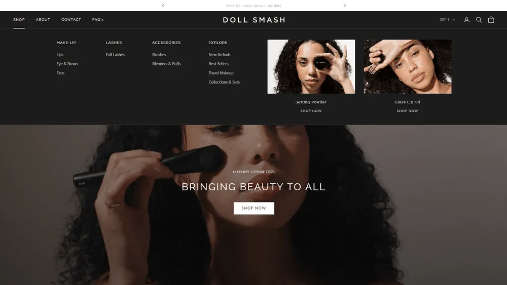
⚠️ 10. Jumpy Layouts & Misclick Moments
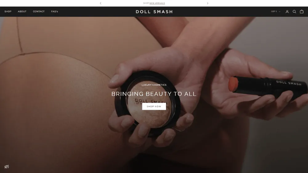
Users try to click the section to find out more or the button to get in touch with you and the page moves under their finger/mouse. When the page shifts, your website looks broken - and users don’t trust broken.
Usually caused by:
- Images without fixed dimensions (layout shift)
- Late-loading fonts [lazy load]
- Cookie banners or sticky bars are injected after load
- Ads/embeds are loading above the content
Why does it cost you sales/conversion?
Your website feels or even worse, looks broken and creates instant distrust before even sharing what you do.
EXAMPLE:
A product page on Doll Smash stopped shifting once image spaces were reserved and adjusted. Add-to-cart clicks became smoother and checkout starts increased.
How to fix it?
- Set image width/height or reserve space
- Avoid injecting new content above the fold after load
- Optimise font loading to reduce shifting
- Be careful with sticky banners and consent popups
Beginner Tip:
If your page “moves” while loading, fix that before anything else. Thorough testing is a must before launching your business. Also, every week/month, take some time reviewing all pages for any bugs or set up a retainer with an agency.
Intermediate Tip:
Monitor CLS and check which sections cause the most layout shift.
⚠️ 11. Accessibility Issues That Quietly Block Buyers

Some users literally can’t complete your form or checkout, which means your conversion rate has a massive drop out.
Usually caused by:
- Low contrast text
- Forms without proper labels
- No visible focus states for keyboard users
- Headings used for style, not structure
- Important text embedded inside images
Why does it cost you sales/conversion?
Accessibility is usability. Usability converts visitors to clients.
EXAMPLE:
For a self-employed website we improved contrast and added form labels in the dropdown section, and the client reports that form submissions are now being received.
How to fix it?
- Increase text contrast and line height
- Label every input properly
- Add visible keyboard focus states
- Use correct heading structure (H1, then H2, etc.)
- Don’t hide key info inside images
Beginner Tip:
Try navigating your site with only a keyboard. If it’s painful, it’s costing you.
Intermediate Tip:
Run an accessibility audit and fix issues on revenue pages first (pricing, product, checkout).
⚠️ 12. Overused Stock Photos

Your site feels templated because the visuals don’t match a real business. Most likely, you are using the images from the template or a cheap/free version.
Usually caused by:
- Overused stock photos (handshakes, fake offices, smiling call centres)
- Inconsistent emoji styles across sections
- Emojis used for “vibes” instead of clarity
- Emojis replacing labels in navigation or tables
Why does it cost you sales/conversion?
If your visuals appear low-quality, potential customers may perceive your business as mediocre, leading to a lack of trust and missed opportunities for engagement and sales.
EXAMPLE:
For a consulting firm, we replaced impersonal stock photos with real team photos taken in the office and swapped mismatched emojis for a consistent set of icons. The site immediately felt more authentic and professional, and enquiries increased because visitors trusted the brand more.
How to fix it?
- Use real photos: team, workspace, product, process
- If using stock, avoid clichés and keep a consistent style
- Use emojis only as UX cues (benefits, steps, warnings)
- Never rely on emojis instead of text labels
Beginner Tip:
If a visual doesn’t improve understanding, remove it. Personalise your site for a better user experience.
Intermediate Tip:
Create a simple style rule: one photo style + one icon/emoji style + repeatable feature blocks.
⚠️ 13. Overdone Animations That Distract
A flashy, animation-heavy site may look cool, but it is a common website design mistake - it harms usability, load speed and mostly clarity.
Usually caused by:
- Heavy parallax everywhere
- Scroll-jacking interactions
- Long intro animations are delaying content
- Motion that doesn’t respect reduced-motion preferences
Why does it cost you sales/conversion?
Users leave if they can’t get to the point quickly. Keep content clear, animations subtle and pages loading under 5 seconds to retain visitors.
EXAMPLE:
For a music agency, we reduced motion elements, removed scroll-jacking and improved conversion based on their Google Analytics - pages picked up more traffic on mobile devices.
How to fix it?
- Use motion to support understanding (not as decoration)
- Keep animations short and subtle
- Never block content behind animation
- Respect reduced-motion settings
Beginner Tip:
If animation delays reading or clicking, it’s a conversion killer and you should remove it.
Intermediate Tip:
Measure interaction delay (INP) on animated pages and cut the heaviest effects first.
⚠️ 14. Hard to Scan Content Structure
Your writing may be great for you, but not for your audience. It's formatted like a wall of text that few want to read or engage with.
Usually caused by:
- Long paragraphs with no subheadings
- No bullets or summaries
- No “what you get” section
- No FAQs answering objections
Why does it cost you sales/conversion?
In 2026, people skim first and only then read. If they can’t extract value fast via Headings or Subheadings they bounce.
EXAMPLE:
On our homepage, we included meaningful summaries, scannable headings and FAQs that helped to increase conversions because users understood the offer more quickly.
How to fix it?
- Add clear H2 sections every 200 - 300 words
- Use short paragraphs for benefits and inclusions
- Add a “Process” and “What’s included” block
- Add FAQs that address pricing, timelines, risk, and trust
Beginner Tip:
If it can’t be skimmed, it won’t convert. Ensure you write with intention (Problem -> Solution), not for keyword stuffing.
Intermediate Tip:
Match headings to user intent: “Pricing”, “Timeline”, “What you get”, “Who it’s for”, “Results”.
⚠️ 15. No Tracking or Funnel Visibility
You don’t know where users drop off, so you guess at best, which ain't working and it's a terrible approach.
Usually caused by:
- Only tracking page views
- No conversion events set up
- No funnel steps for forms/checkout
- No separation of mobile vs desktop performance
Why does it cost you sales/conversion?
You can’t fix what you can’t see. Revenue leaks stay hidden.
EXAMPLE:
A recruitment consulting firm had 60% user drop off at the application form step, which analytics showed was caused by a long multi-page form. After simplifying the form, the client saw a marked improvement in completion rates.
How to fix it?
- Set up conversion events (purchase, form submit, booking complete)
- Track funnel steps (form start → submit, checkout step drop-off)
- Segment by device and traffic source
- Use heatmaps/session recordings to spot friction (ethically)
Beginner Tip:
Start with tracking just 3 events: call to action click, form submit, purchase/booking.
Intermediate Tip:
Build a simple dashboard that shows conversion rate by device, page template and channel.
-------------------------------------------------------
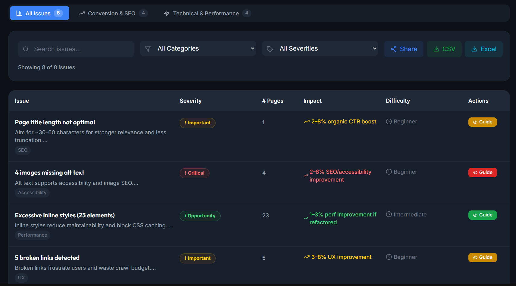
Website Audit Toolkit to Fix Conversion Killers
🚀 1. BulmaScanner AI
Free tool: Conversion blocker audit tool. You drop in a URL and it flags UX/UI issues that typically kill conversions, then gives you a quick list of actionable fixes.
Good for:
- Fast, beginner-friendly conversion audit when you don’t know where to start
- Spotting common sales killers on landing pages
- Quick “before/after” checks after you tweak hero copy, CTAs, layout, or trust sections
-------------------------------------------------------
🚀 2. PageSpeed Insights
Free tool: Performance checker that reports both mobile and desktop experience, then gives prioritised recommendations to improve a specific page.
Good for:
- Finding why a page feels slow (LCP, CLS, CSS, INP, render-blocking resources)
- Quick before/after checks when you compress images or remove scripts
- Spotting Core Web Vitals issues that hurt real user experience (not just “speed scores”)
-------------------------------------------------------
🚀 3. Microsoft Clarity
Free tool: User behaviour analytics tool that shows how people actually use your site via session recordings and heatmaps - not what you think they do.
Good for:
- Seeing rage clicks, dead clicks and scroll drop-offs (conversion leaks)
- Diagnosing confusing navigation, weak call actions, bad mobile UX
- Watching form abandonment in the real world
-------------------------------------------------------
🚀 4. Pingdom Web Page Speed
Free tool: A simple speed test that reports load time, page size, number of requests, and gives performance suggestions.
Good for:
- Quick “is this page heavy?” checks (requests + total weight)
- Comparing page performance after optimising images/scripts
- A fast sanity-check when you don’t want a full lab setup
-------------------------------------------------------
🚀 5. SEObility
Free tool: Quick “single-page audit” tool. You paste in a URL and it scans the page like a search engine bot, checking technical + on-page SEO factors and then gives you a prioritised list of issues and fixes.
Good for:
- Fast on-page SEO checks: titles, meta descriptions, headings and more
- Spotting technical mistakes
- Quick “before/after” validation when you tweak a page
-------------------------------------------------------
🚀 6. Semrush
Paid tool: A broad SEO and competitive marketing suite - strong for keyword research, competitor analysis and site auditing.
Good for:
- Finding what keywords drive competitor traffic (and content gaps)
- Running technical SEO audits at scale (broken pages, duplicate issues, etc.)
- Building content plans based on real query data and intent
-------------------------------------------------------
🚀 7. Hotjar
Paid tool: A UX insights tool that combines heatmaps/recordings with feedback tools (like surveys) to understand why users behave the way they do.
Good for:
- Pairing behaviour (heatmaps) with intent (“what stopped you today?” surveys)
- Identifying friction in landing pages, product pages, and forms
- Prioritising redesign decisions based on user evidence
-------------------------------------------------------
🚀 8. BrowserStack
Paid tool: A cross-browser/device testing platform that lets you test how your site behaves across real devices and browsers in the cloud (instead of guessing).
Good for:
- Catching “it breaks on iPhone Safari” issues before users do
- Testing responsiveness, forms, sticky elements, and checkout behaviour
- Validating fixes across multiple device/browser combinations quickly
-------------------------------------------------------
🚀 9. Jasper
Paid tool: AI platform built specifically for marketing teams and copywriting - not just “write me a blog post”, but structured brand-safe content creation.
Good for:
- Generate clearer, outcome-led headlines, subheads
- Turning walls of text into scannable sections
- Speeding up production of supporting assets
- Easy content writer dashboard
-------------------------------------------------------
🚀 10. Artlist.io
Paid tool: Library for royalty-free creative assets - music, sound effects, footage, templates with licensing designed for publishing and monetisation use cases across common platforms.
Good for:
- You can upgrade your site’s brand feel with higher-quality video/footage assets
- Creating more premium, trust-building content
- Building consistent, on-brand motion assets

Search Engine Optimisation Tips
=> Match page intent, not just keywords
- Each money page should target one clear query type (service, pricing, comparison, location) so users land on the right page and convert.
=> Rewrite titles for clicks, not “SEO stuffing”
- Use a clear promise + keyword + proof (example: “Web Design London - Conversion-Focused Sites (Fast, SEO-Ready)”).
=> Fix duplicate pages and repeated blocks
- If the same testimonials/FAQ/component appears across many pages, search engines may treat pages as less unique. Use variations or limit repeated text.
=> Strengthen internal linking to money pages
- Link from blogs to your services/pricing pages using natural anchor text (not “click here”).
=> Improve above-the-fold relevance
- Your H1 and first paragraph should repeat the user’s problem and outcome. If Google sends traffic but users bounce, your message doesn’t match intent.
=> Add schema where it helps conversions
- LocalBusiness, Organisation, Service, Product, Review (only if real), FAQ (only if it’s truly on-page). This can improve CTR and qualified traffic.
=> Make pages fast and stable
- Core Web Vitals (LCP/CLS/INP) impact experience. Slow pages don’t just rank worse - they convert worse.
=> Don’t hide key info behind tabs/accordions everywhere
- It’s fine for FAQs, but your core value (pricing ranges, what’s included, proof) should be visible and scannable.
=> Create one strong location page per area (if local)
- Avoid thin “city swap” pages. Add real local proof (projects, testimonials, map area, office details).
=> Track SEO by conversions, not traffic
- In GA4 measure which landing pages drive leads/sales, then double down on those topics.
-------------------------------------------------------
5 Modern Website Design Examples
🖼️ 1. Beesting:
Webflow: https://beesting.xyz
- Bold, modern typography and strong visual hierarchy (you instantly know what matters)
- Clear “direction” through the page (sections feel intentional, not random)
- Great example for brands that want a premium, design-forward feel
-------------------------------------------------------
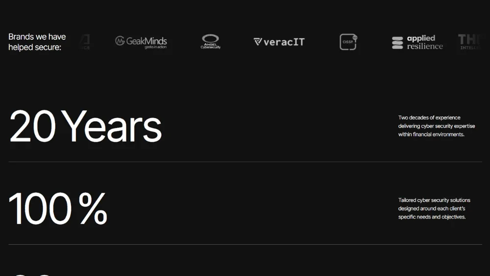
🖼️ 2. Onion Security:
Webflow: https://onionsecurity.co.uk
- Trust-led positioning (security needs credibility fast)
- Clean structure that makes complex services feel digestible
- Strong “expert” tone without being corporate or boring
-------------------------------------------------------
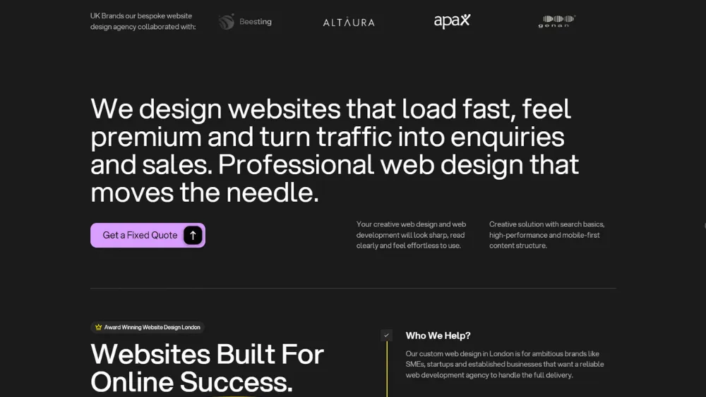
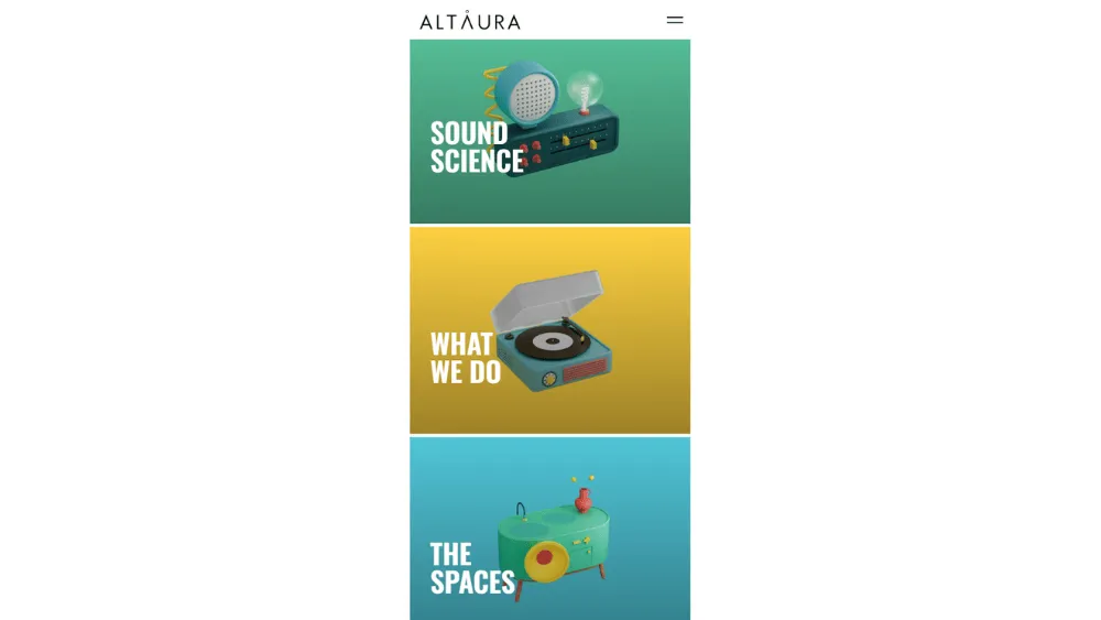
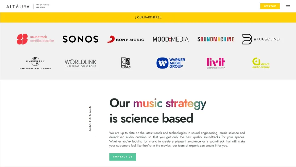
🖼️ 3. Altaura:
Webflow: https://altaura-agency.webflow.io
- Modern Webflow-style layout with clean spacing and strong section rhythm
- Good use of subtle motion and polish without overwhelming the content
- Clear agency presentation style (services, process, credibility)
-------------------------------------------------------
🖼️ 4. TopUpMeter:
Webflow: https://www.topupmeters.co.uk
- Utility-first clarity (users can complete the task quickly)
- Straightforward navigation and obvious next steps
- Good example of reducing friction for a functional service site
-------------------------------------------------------
🖼️ 5. 2D Figure Painting:
Shopify: https://2dfigurepainting.com
- Strong product visuals and niche identity (instantly clear what it is)
- Good “collector” positioning potential: proof, process, and uniqueness can drive conversion
- Great candidate for trust stacking (reviews, shipping, guarantees, before/after)
Conclusion: Slow Loading & Mobile Design
If you want to avoid common website design mistakes, focus on what actually drives action: speed, clarity, trust, and a smooth mobile journey. Your first impression is made in seconds, and if the page feels confusing or slow, your ideal customers won’t wait around to “figure it out”.
The best digital marketing in the world can’t save a site that leaks conversions - so keep the amount of text tight, make every section earn its place, and remove anything that adds friction.
Frequently Asked Question
How to avoid bad website design?
- Start with a clear headline that says what you do, who you help and the outcome (especially if you specialise in a niche).
- Make the page easy to read with short paragraphs, clear headings, and one primary CTA.
- Avoid a complicated website structure (too many menu items, too many animations, too many form fields)
- Regularly test the full journey on mobile, because that’s where most users decide to stay or leave.
What are the 7 C's of website design?
- Clarity: users instantly understand what you offer
- Content: useful, structured, and scannable
- Consistency: design patterns and UI behave the same everywhere
- Credibility: proof, reviews, policies, and trust signals at decision points
- Conversion: one clear next step per page and friction-free forms/checkout
- Convenience: mobile-first, accessible, fast
- Connection: internal linking and navigation that help users find what they need quickly
What are the 5 golden rules of web design?
- Make it obvious: clear message, clear CTA, clear next step
- Make it fast: optimise images, reduce scripts, avoid heavy motion
- Make it scannable: headings, bullets, short paragraphs, strong hierarchy
- Make it trustworthy: proof near pricing/forms/checkout, clear policies
- Make it mobile-first: thumb-friendly buttons, readable text, no intrusive popups
What site builder has the best website usability?
- Best for beginners who want the easiest setup: Wix or Squarespace (low learning curve, quick to publish)
- Best for e-commerce usability: Shopify (smooth product + checkout management)
- Best for results and lead gen: Webflow (performance, design, SEO)
Which are the best web development agencies in London?
- Fit Design: Conversion-focused web design and development agency in London for businesses that want results.
- KOTA: Award-winning creative digital agency based in London (and NYC), specialising in web design, branding and digital marketing.
- Yellowball: Boutique London web design agency crafting bespoke websites designed for large organisations.
- Lilo: Award-winning London web design and development agency specialising in web design/dev and ecommerce platforms like WordPress and Shopify.
- Fhoke: London web design agency designing and developing Shopify websites (and bespoke web apps).