

Stay updated with our letter
Valuable perspectives on the latest trends and tips.
.avif)


14 Latest Website Design Trends | Inspiration vs Trend



Key takeaway: A design trend earns its place when it clarifies the offer, improves a task or gives a brand a distinctive voice. Start with the content and audience, then test the effect across devices and input methods.
Web design inspiration is easy to collect and harder to use well. A dramatic composition may look excellent in a portfolio shot, yet become awkward once a real headline wraps, a CMS item changes length or someone opens the page on a small phone. The useful question is not “is this fashionable?” but “what does this choice help a visitor understand or do?”
These fourteen visual directions are a working vocabulary, not a forecast that every website should follow. The examples illustrate a technique at a particular point in time; the linked sites can change. Treat each image as inspiration and run the simple checks below before using it in production.
Fourteen design directions worth testing
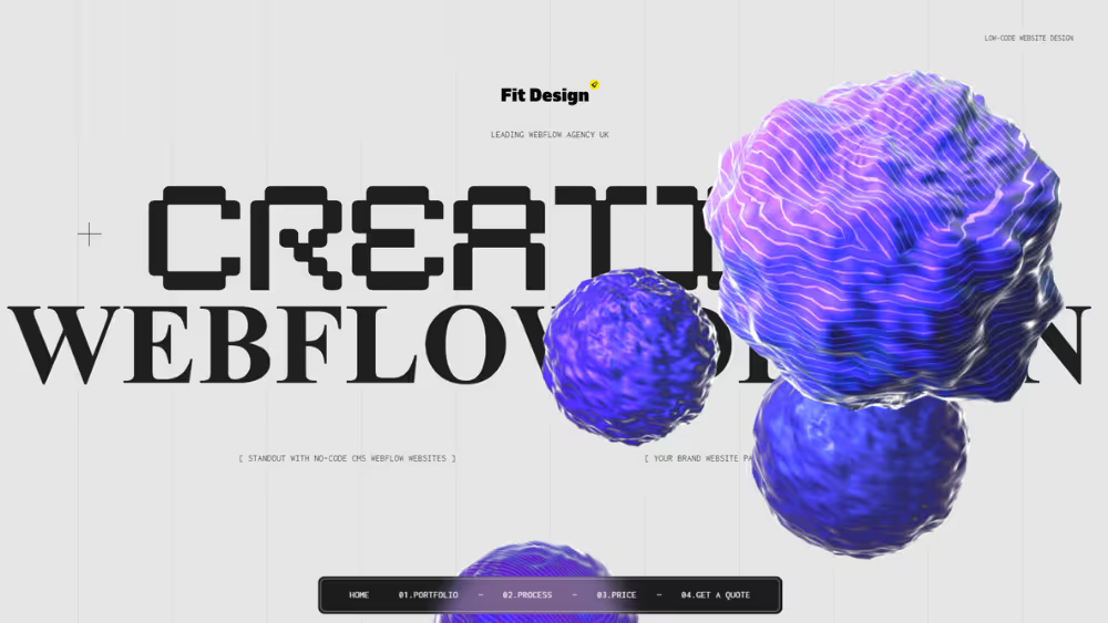
1. Depth and restrained 3D
Depth can reveal how a product works, establish material quality or add a memorable transition. It is strongest when the object carries meaning. A rotating model that delays the first useful sentence or competes with the call to action is expensive decoration. Our Webflow development work uses visual depth selectively where it supports the story.
Provide a still fallback and a clear reading order. Test loading on a mid-range phone, keyboard access, contrast over moving backgrounds and reduced-motion settings before making a 3D hero central to the experience.
2. Split-screen storytelling
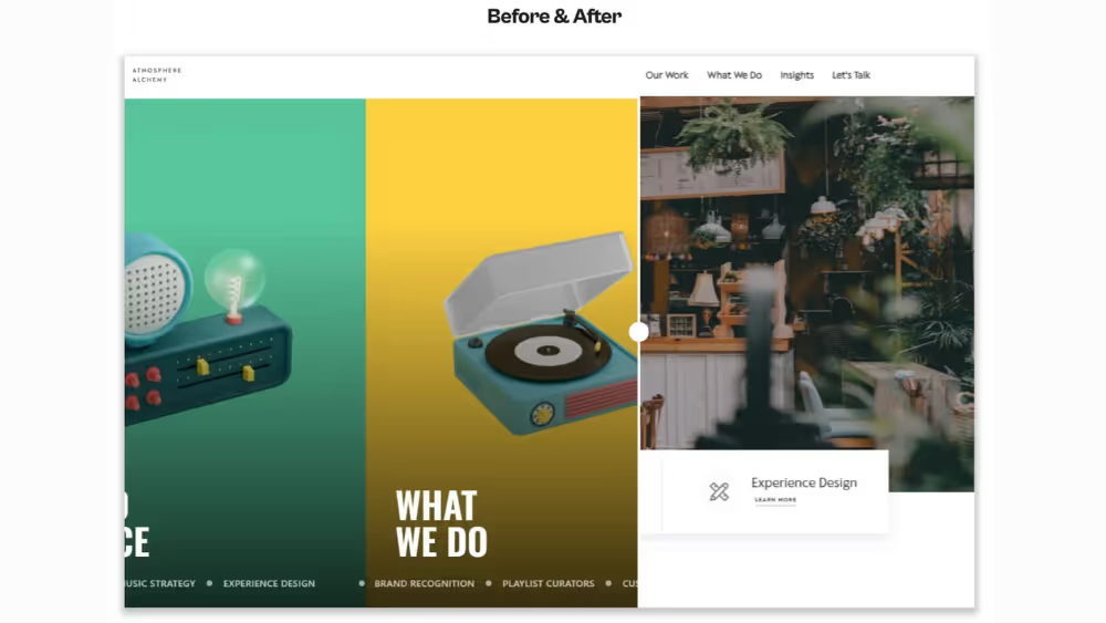
Two columns can compare alternatives, show a before-and-after, or connect a claim to evidence. The Altaura project is an example of using side-by-side presentation to frame a choice. On mobile, the columns become a sequence: decide which side readers need first and make the relationship explicit in headings or labels.
Avoid dividing the screen just to create symmetry. Both halves need a clear purpose and enough room for the real content. Test the layout with longer translated text and a 200% zoom view.
3. Asymmetry with a reading path
Asymmetry gives a page energy by varying width, alignment and scale. It should still lead the eye from the main message to the next useful action. A simple banner design tool can help mock a composition, but a polished static mock is only the start. A site such as Nowness can offer editorial inspiration; study how its visual hierarchy works before borrowing the surface style.
Use a stable grid underneath the apparent freedom. Check that headings, captions and buttons still read in a sensible order on narrow screens and through assistive technology.
4. Micro interactions that confirm an action
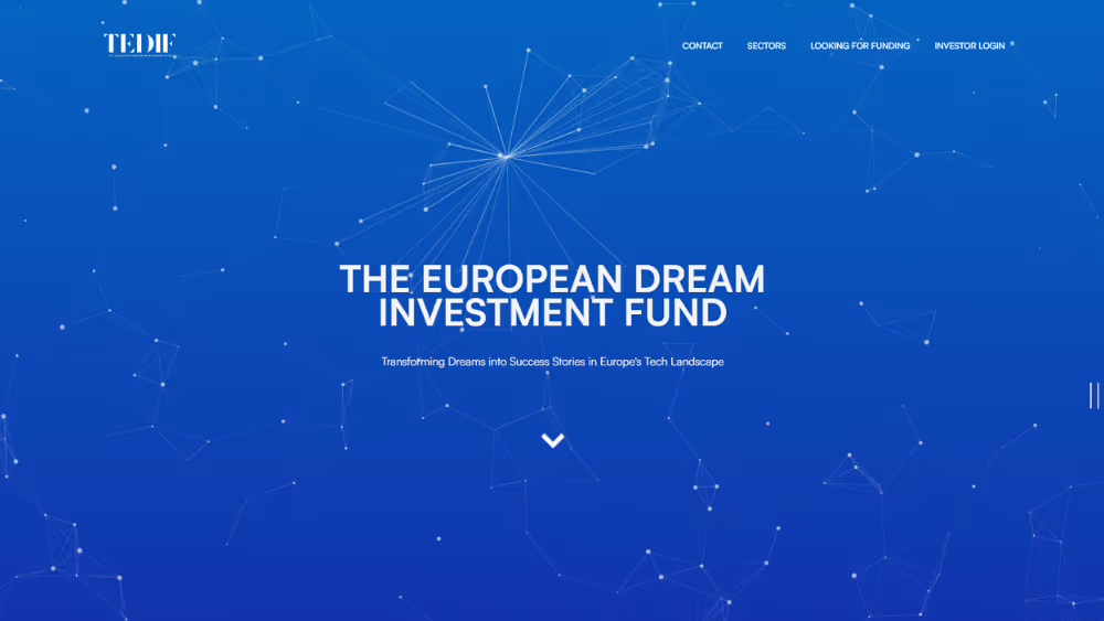
Small transitions can confirm that a menu opened, a filter applied or a card changed state. The point is feedback, not constant motion. TEDIF is one reference for interaction details; inspect the task a visitor is completing rather than copying an animation in isolation.
Keep durations short, avoid animating large areas without a reason and preserve visible focus. Offer a reduced-motion version for people who request it; MDN documents the prefers-reduced-motion media feature.
5. Organic shapes and softer edges
Curves and irregular outlines can make a technical service feel more human or connect sections through a visual motif. Use them in a repeated system rather than as unrelated blobs. A shape is most effective when it frames an image or creates a recognizable brand element without masking important copy.
Test cropping at several aspect ratios and keep decorative layers out of the interactive hit area. If a shape has no meaning, it should not add noise to the accessible reading experience.
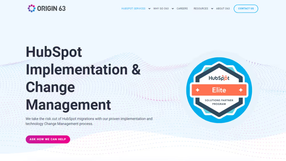
6. Solid blocks with clear hierarchy
Large blocks are useful for distinct service categories or stages in a process. They make scanning easier when each block has a short, specific heading and a different job. Dropbox is a reference for looking at how content is grouped, though its live page may differ from this illustration.
Avoid turning every paragraph into a card. Too many equal boxes flatten the hierarchy, create a long mobile stack and make an editorial article feel like an instruction manual. Let ordinary prose carry the explanation between grouped elements.
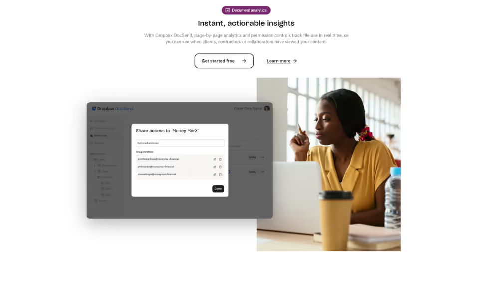
7. Monochrome with a deliberate accent
Black and white can create a strong editorial frame for photography and typography. A restrained accent can mark actions or navigation states. The Opportunity Agenda offers one site to study for colour discipline. Do not assume monochrome automatically creates accessible contrast; measure text, controls and hover states.
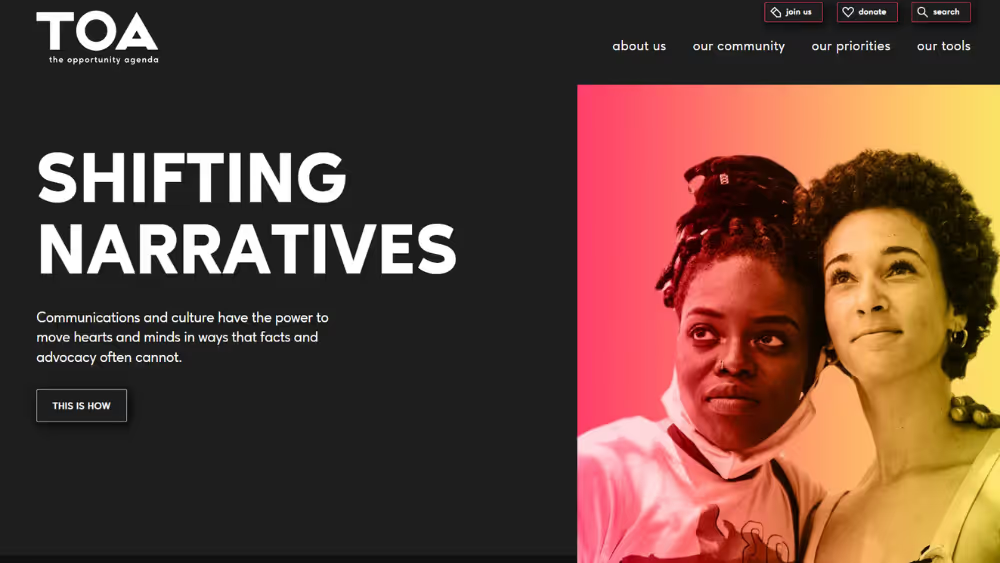
8. Large type used as structure
Oversized typography can make the proposition immediate and provide a recognizable voice. Our typography guide explains the role of type beyond font selection. The Reiki Healer website is another visual reference for scale, though the right scale for a service site depends on its copy and audience.
Keep body text comfortable to read and allow headings to wrap naturally. Test real names, longer words, translation, zoom and mobile widths. A headline that looks striking at desktop size can swallow the entire first screen on a phone.
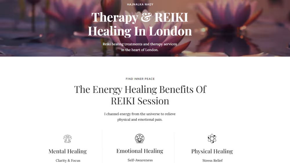
9. Image and text masking
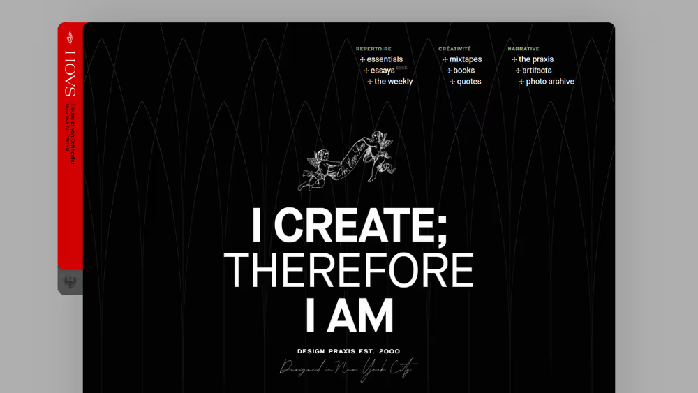
A photograph revealed through a shape or headline can create a strong campaign moment. Tobias van Schneider is a reference for experimental visual treatment. Use masking where the image contributes meaning, with readable text outside the effect when needed.
Check contrast on every frame or crop, and make sure the message remains available if an animation is disabled or the image fails to load. The masked result should not become the only way to read a key statement.
10. Line illustration
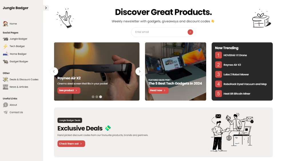
A consistent line style can explain a service, show steps or give a brand a light visual signature. Junglebadger is a reference for illustrated treatment. Keep stroke weight visible at small sizes and draw one meaningful concept per illustration rather than filling gaps with generic symbols.
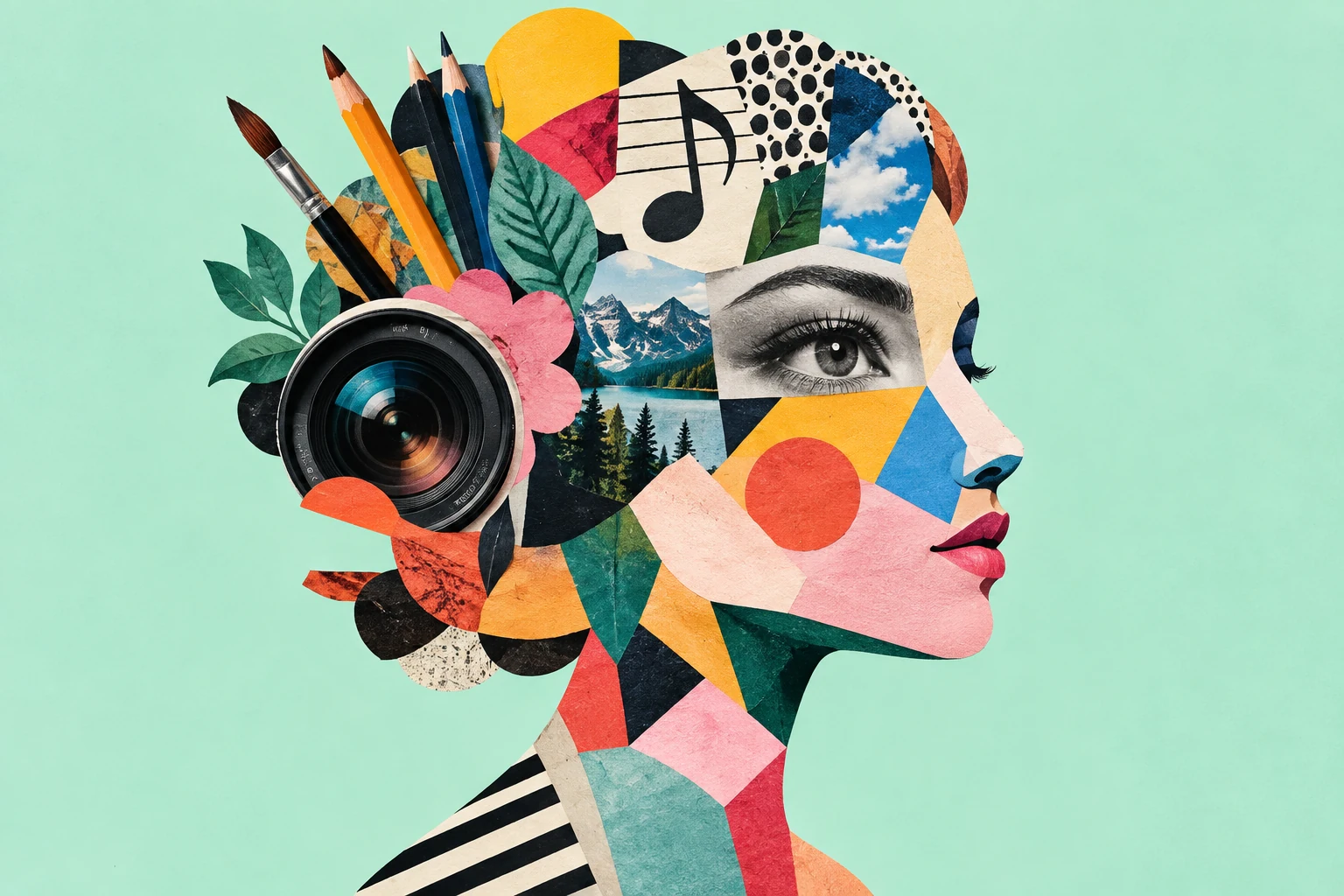
11. Collage of photography and drawing
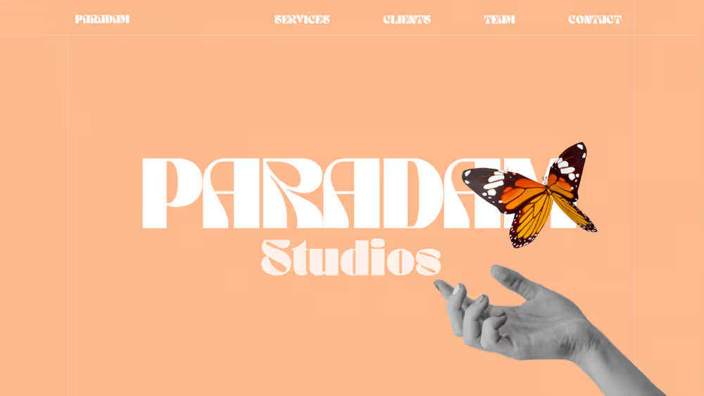
Collage can bring personality to stories that need both a human subject and an abstract idea. The Webflow collage gallery offers a range of approaches. Build a coherent image system first: decide how subjects are cut out, what textures repeat and how captions relate to the composite.
Do not paste several similarly sized graphics one after another. Give each image breathing room and a reason to appear at that point in the article. Keep the underlying photos clear enough to understand at mobile size.
12. Simplified illustration
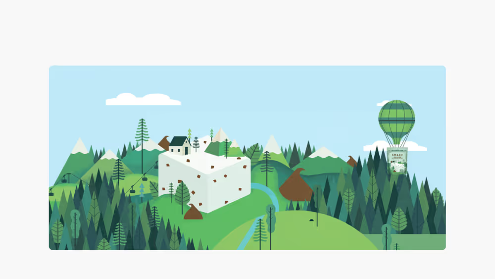
Flat or reduced illustrations can clarify abstract concepts, especially when custom photography cannot show them. The Awwwards illustration examples can help compare styles. Choose one visual grammar and use labels where a drawing alone could be ambiguous.
Avoid familiar stock metaphors that add no information. If the purpose is to explain a process, test whether a short sentence or a real screenshot would serve readers better.
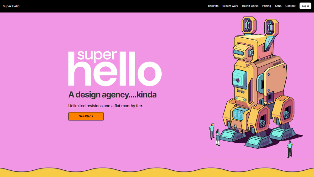
13. Isometric views
Isometric drawing can show a system, place or workflow from a consistent angle. It can help explain connected parts of a product when a flat icon set would be too abstract. It becomes less useful when each tiny object needs a separate legend or the scene cannot be read on a phone.
Offer a simpler crop or labelled diagram for small screens. Keep decorative perspective from distorting quantities or relationships that need to be exact.
14. Geometric shapes as a visual system
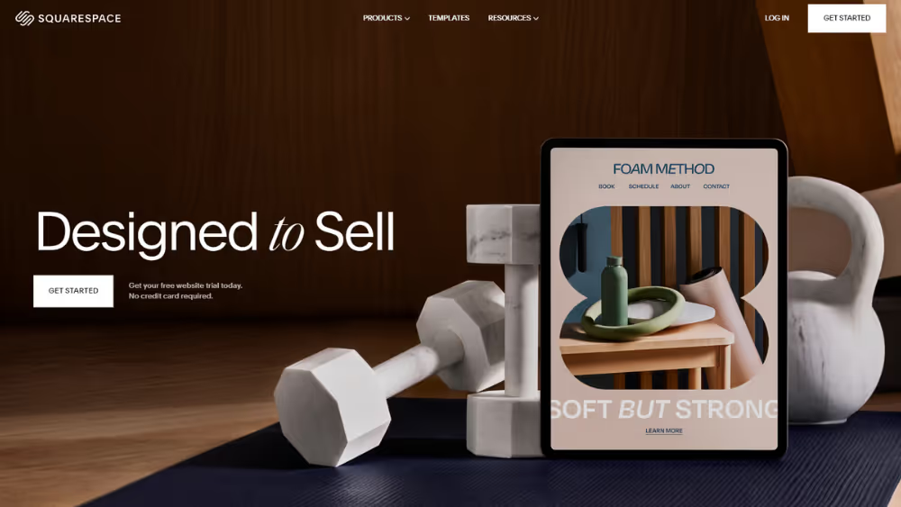
Circles, bars and polygons can organize a brand with repeatable forms. Squarespace offers examples of adaptable design systems across templates. The strength comes from consistency: set rules for proportion, colour, spacing and motion, then apply them across the site.
Geometric decoration should never obscure a control or make a link appear like ordinary text. Test its role in navigation and content hierarchy, not just in a hero image.
Choose the trend that supports the task
Start with the page’s job. For a service page, help visitors identify the offer, proof and next step. For a product, show how it works and resolve objections. For an editorial page, help readers follow an argument. Then choose the visual treatment that reinforces those priorities. This is also a useful moment to revisit our website redesign guidance before adding an effect to an existing page.
- Clarity: can a first-time visitor explain the offer after one screen?
- Accessibility: can someone use it by keyboard, at zoom and with reduced motion?
- Performance: do images reserve space and load at appropriate sizes?
- Maintenance: can editors add real content without breaking the composition?
- Evidence: does the idea improve understanding or a task in user testing?
W3C guidance on reflow and reduced-motion techniques provides useful checks. For imagery, Google’s Core Web Vitals CSS guidance explains how reserved image dimensions can avoid layout shifts. These are practical design constraints, not afterthoughts.
The strongest result usually combines a distinctive visual system with ordinary, reliable navigation and readable content. Our website design guide covers the broader planning work. Pick a few ideas with a clear purpose, prototype them with real content, and let the rest remain inspiration.
.webp)
Where ideas come to life
We explore various aspects of modern life, offering valuable perspectives on the latest trends, and helpful tips.

