

Stay updated with our letter
Valuable perspectives on the latest trends and tips.
.avif)


Improve Your Website In Business | 12 Tips To Increase Sales
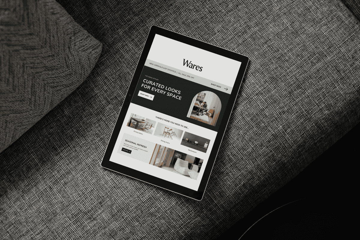


Improving a business website starts with the moments that matter to customers: understanding the offer, finding a suitable product or service, trusting the evidence and getting a response. A useful change removes a specific obstacle in that journey.
In the digital era, being available online is only part of the job. A site can look polished and still leave visitors unsure whether the business serves their area or offers the work they need. Another can explain the service well but lose enquiries through an unreliable form. The priorities should follow those problems.
The twelve improvements below are a way to investigate and strengthen the experience. They do not promise that changing a button colour or adding a popup will increase sales. Choose the changes that address an observed need, implement them carefully and check what happens.
Begin with a short, practical review
Follow the main journey before running a collection of audit tools. Open the site on a phone, identify the offer, find a relevant service and attempt the intended action. Record where you hesitate or need information that is missing. Ask someone unfamiliar with the business to try the same task without coaching.
Then investigate technical issues that may interfere with that journey. Performance can affect usability, but a speed score is not a complete explanation of Google rankings or business results. Test representative pages under comparable conditions and distinguish a laboratory test from information about real visitors.
WebPageTest is one option for examining page-loading behaviour. Use its findings to investigate specific assets or requests rather than treating the overall result as a redesign brief. Compress large images where appropriate, serve suitable dimensions and review unnecessary scripts. Check the page afterwards so the improvement does not remove important detail or functionality.
Tools such as Sitechecker can support a mobile review, but inspection on actual devices still matters. Check whether headings wrap comfortably, menus open and close, forms remain readable and tables scroll within their own region. Test keyboard access as well as touch. A layout can fit the screen while still being difficult to operate.
Microsoft Clarity offers heatmaps and session recordings that can help investigate interaction patterns. Configure any analytics appropriately for the site and the information it handles. Treat the recordings as evidence to interpret, not a direct account of what someone was thinking. A repeated click may indicate confusion, an unresponsive control or something else that needs testing.
An SEO review tool such as SEOmator can help identify issues to investigate. Confirm findings against the actual page and its purpose. An automated report cannot decide whether a service explanation is convincing, whether two pages address different needs or whether a customer's question has been answered accurately.
1. Make the offer clear at the start
The opening should tell an appropriate visitor what you offer and why it is relevant to them. Use a direct heading and a short explanation of the audience, service or outcome. Avoid asking a vague slogan to carry all of that information on its own.
For example, a hypothetical joinery business could explain that it designs and installs fitted furniture for homes in a defined service area. The supporting sentence can describe the kinds of projects it handles. That is more useful than “Crafting excellence” without context, even if the latter sounds more distinctive during a branding discussion.
Be equally clear about boundaries. If you handle residential projects but not commercial work, or serve particular locations, say so in the relevant context. This can help a visitor decide whether to continue and reduce avoidable exchanges with the team. Clarity is not only about attracting more enquiries; it is also about helping people recognise when the offer is suitable.
2. Use real evidence and a recognisable identity
Relevant work, accurate testimonials and clear information about the business can support trust. Keep the identity recognisable across the website, social profiles and physical touchpoints such as neon signs. Consistency helps connect those experiences, but it is the evidence behind the presentation that gives a visitor reasons to believe you.
Build brand awareness through material that reflects what the business actually does. A short account of a completed project can explain the challenge, your contribution and the result you can substantiate. Avoid turning a client's logo into an implied endorsement beyond what the relationship supports.
Check the practical details across profiles as well. A resource about the logo LinkedIn identity may help when preparing a platform-specific asset, but your business's own profile image and company information should remain recognisable. Consistent names, contact routes and visual assets make it easier for people to confirm that they have found the right organisation.
3. Make buttons describe the next action
A useful button sets an accurate expectation. “Request a quote” should lead to a quote request, while “View projects” should lead to relevant work. “Learn more” can be appropriate when the destination is clear from context; it does not become ineffective simply because it is familiar.
Choose the prominence of each action according to the page. A visitor reading an introductory article may need a related guide before a sales conversation. Someone comparing a specific service may be ready to enquire. Avoid presenting every secondary link as a competing primary button or making a sticky control cover the content on mobile.
Inspect what happens after the button is selected. A short form should use clear labels, indicate required information and explain errors where they occur. Do not rely on placeholder text that disappears when someone starts typing. After successful submission, explain the next step without promising a response time the team cannot consistently meet.
For an online store, the equivalent review includes product options, stock states and basket changes. A customer who selects an unavailable size needs an understandable response, not an apparently active purchase button that fails later. These details rarely dominate a design presentation, but they determine whether the person can finish the task the page encouraged them to begin.
4. Choose images that explain the business
Real photographs can show the team, work, product or setting customers will encounter. They are particularly useful when the detail supports a decision: a finished installation, the scale of a product or the people responsible for delivery. Plan the image around the question it answers.
Stock imagery and illustration can still be appropriate, but they should have a clear role. A generic group around a laptop is weak evidence of specialist experience. Keep image quality, crop and loading behaviour in view, and write alternatives that describe meaningful content. Do not make an image the only place essential information appears.
5. Write for both scanning and careful reading
Visitors do not all read in the same way. Clear headings help someone scan for relevance, while developed paragraphs explain details to a person making a more considered decision. The answer is not to replace every paragraph with bullets or assume nobody reads long content.
Give each section a clear purpose and let the paragraphs build on one another. Use lists for genuinely parallel items, such as what a service includes, rather than breaking every explanation into fragments. Remove repeated claims and vague adjectives, but keep the qualifications and examples that help the reader understand the offer.
6. Organise navigation around recognisable needs
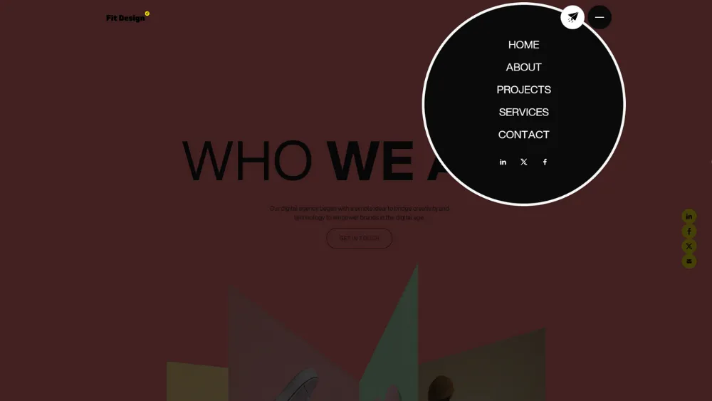
Use labels the audience understands and group related information sensibly. There is no universal number of menu items or one-click rule that suits every business. A few clear steps can be easier than one crowded menu containing every destination.
Test ordinary tasks. Can a prospective client find the relevant service and a comparable project? Can an existing customer find support without entering the sales journey? Review the mobile menu separately, including opening, closing and returning to the page. Navigation quality is something to observe through use, not just judge in a static design.
7. Publish useful articles with a clear reason to exist
A blog can answer questions that need more space than a service page. Choose subjects from customer conversations, recurring sales questions and relevant search information. Explain the decision or problem thoroughly enough to be useful, with examples and links that help the reader continue.
Do not use a fixed word count or publication frequency as proof of quality. A short answer may be enough for a narrow question; a complex comparison may need much more detail. Keep useful older articles current and preserve established URLs where appropriate. Publishing another generic post is not automatically better than improving one that already helps readers.
8. Use visual cues with restraint
Icons, colour and emphasis can make important information easier to recognise. A caution symbol may identify a limitation; a small label can distinguish an example from a recommendation. The cue should clarify meaning rather than decorate every heading.
Keep ordinary headings readable and give the page a consistent hierarchy. Avoid filling every section with cards, badges or competing accent colours. If removing the decorative elements makes the article impossible to follow, the underlying structure needs attention. A business website can have personality without making every paragraph an interface component.
9. Place reassurance where a question arises
Put relevant proof close to the claim it supports. A service page can show a comparable project near the explanation of that work. A product page can make delivery, returns and specifications easy to find before purchase. A contact form can explain what happens after submission.
Use only authentic reviews, permissions and credentials. Do not invent urgency, display unsupported badges or edit a testimonial until its meaning changes. A clear account of your process and responsibilities often provides more reassurance than a large collection of unexplained trust symbols.
10. Remove interruptions before adding popups
A popup should solve a real communication need, not appear because a template includes one. Consider whether an inline offer or clear link could do the same job with less disruption. An offer that obscures the page before the visitor understands the business can create another obstacle.
If a modal is justified, make it easy to dismiss and usable with a keyboard. Check its behaviour on a small screen and avoid repeatedly reopening it during the same task. A timed appearance is not the same as detecting an intention to leave. Evaluate the effect on the complete journey rather than counting only the leads captured by the popup.
11. Answer the questions that delay decisions
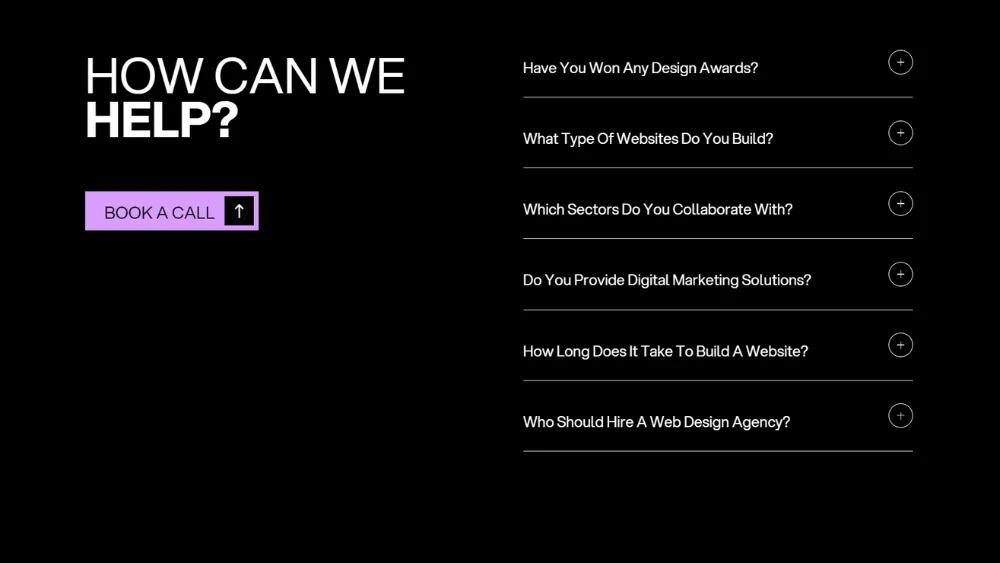
Use FAQs for genuine questions about the product, service or process. They may concern suitability, preparation, delivery or what happens next. Answer directly and place crucial information in the main content when the decision depends on it, rather than hiding it at the bottom of an accordion.
Review the questions with the people handling enquiries. If customers repeatedly ask what is included, the service explanation may need work as well as an FAQ. A concise optional reference section can be useful, but it should not compensate for an incomplete page or repeat the entire article in question form.
Where an answer depends on the project, explain the dependency. A pricing question may need a description of the factors that change the quote rather than an invented universal figure. A timing question may depend on content readiness or availability. An honest, specific explanation helps the customer prepare for a conversation and is more useful than either an unsupported promise or a vague instruction to get in touch.
12. Explain the working relationship
People often want to know what happens after they contact a business. Describe the real sequence at an appropriate level: initial discussion, scope, preparation, delivery and follow-up, for example. Explain what the customer needs to supply and where decisions are made.
A simple process description does not need an animated timeline. Use a layout that suits the amount of explanation. If a stage requires several paragraphs, leave room for them. The aim is to make the relationship understandable, including important dependencies, rather than promise that every project follows an effortless path.
Decide what to improve first
Prioritise faults that prevent an essential task, then clarity problems that affect the right audience. A broken enquiry route deserves attention before an ornamental animation. A confusing service description may matter more than changing the entire colour palette.
| Problem | First action | Evidence to check |
|---|---|---|
| Enquiries do not arrive | Investigate the complete form journey | Confirmed delivery to the receiving team |
| Visitors misunderstand the offer | Clarify the opening and service scope | Observed tasks and enquiry themes |
| Mobile controls are difficult to use | Correct layout and interaction issues | Real-device and keyboard checks |
| Content is hard to maintain | Review templates and CMS fields | An editor completing an ordinary update |
Record the proposed change, the reason for it and how you will check the result. For smaller sites, customer feedback and direct observation may be more informative than an elaborate experiment with too little traffic. Avoid claiming that one adjustment caused a sales increase when several campaigns or business changes happened at the same time.
Improve the existing site or commission a redesign?
Use the current site's constraints to decide. If the message is sound and the platform supports the required work, targeted changes may be sufficient. If the structure no longer fits the business, the CMS prevents ordinary updates or recurring technical problems block progress, a broader redesign may be justified.
A template can provide a useful starting point when its structure matches the content. A bespoke approach gives more room to plan around different requirements. Neither guarantees speed, search performance or sales. Compare the adaptation and maintenance needed to reach the desired result, including content and integrations rather than only visual design.
When discussing improvements with Fit Design, bring the existing website, examples of the problems customers encounter and the outcomes you want to support. That makes it possible to distinguish a small repair from a structural project. Spend on the work the evidence supports, then verify the finished experience before moving to the next change.
Keep the gains after launch
Assign someone to review important content and test essential journeys after changes. Confirm that enquiries reach the right people, images load, contact details remain current and new content fits the established layout. Review frequency should reflect how often the site changes and the consequence of a problem, rather than a universal redesign timetable.
A better business website is built through clear decisions and dependable follow-through. The twelve ideas are starting points for that work. Choose the ones that address a real obstacle, preserve what already works and judge the result through the experience your customers actually receive.
Further guidance: Google on page experience and W3C's accessible forms tutorial. Technical scores and automated audits support a review; they do not replace testing the real user journey.
It can explain the offer, show relevant evidence and give people a route to enquire or buy. Its value depends on how well it supports those tasks and connects to the business’s operations. Being online alone does not guarantee sales.
Fix problems that block an essential task, such as a form that does not deliver or a mobile menu that cannot be used. Then investigate clarity and content problems using customer questions, observed tasks and appropriate analytics.
Not always. Targeted changes may be enough if the existing structure and platform support the business. A redesign becomes more relevant when persistent limitations, outdated positioning or unsuitable content management prevent useful improvements.
A template can work when its structure suits the content and functionality required. A bespoke approach provides more room to plan around different needs. Compare the adaptation, maintenance and total scope rather than assuming one route always performs better.
Update information when the business or its offer changes, and review essential journeys after significant edits. Assign ownership for content and technical checks. A fixed redesign cycle is less useful than monitoring whether the site remains accurate and dependable.


.webp)
Where ideas come to life
We explore various aspects of modern life, offering valuable perspectives on the latest trends, and helpful tips.

