

Stay updated with our letter
Valuable perspectives on the latest trends and tips.
.avif)


7 Powerful Disadvantages of Microsite | Website Example



A microsite gives a campaign room to develop its own story. It also creates another website to explain, promote, measure and maintain. Before separating an idea from your main site, decide what the separation makes possible—and whether a focused section or landing page could do the same job.
The appeal is easy to understand. A product launch, research project or event can feel constrained by the navigation and templates of a larger corporate website. A dedicated experience offers a clearer message and more creative freedom. But that freedom has a cost that is often less visible than the initial design fee.
The seven disadvantages below are reasons to make a deliberate decision, not a claim that microsites always fail. The examples later in the article show different ways to create focused digital experiences. Some are standalone sites; others are campaign pages, editorial projects or historical references within a larger domain. Their value lies in the design decisions, not in treating them all as technically identical.
What counts as a microsite?
A microsite is a small, purpose-focused web experience associated with a wider organisation or campaign. It may contain several pages or a developed single-page story. Teams use the term differently, so agree on the proposed structure before discussing its benefits.
A separate domain is one option, not a defining requirement for every focused campaign. A subdomain or a section of the main website may support a distinctive experience too. The location affects management, navigation and measurement decisions, but it does not determine whether the content is useful.
A landing page normally concentrates on a particular arrival context and action. It can be long or short, and it may sit inside an existing site. A microsite usually provides more room for exploration across a small set of related content. Neither format is automatically more persuasive; the reader’s task determines how much explanation is needed.
| Format | Useful when | Main question |
|---|---|---|
| Landing page | One focused offer or action | Is further exploration needed? |
| Main-site section | Related content shares an audience | Can existing templates support it? |
| Microsite | A distinct experience needs room | Who promotes and maintains it? |
Seven disadvantages to examine before building
1. You can split a journey that should stay connected
A visitor interested in a new product may also need information about the company, support, delivery or an existing service. Moving the campaign to another site can make those connections harder to follow. The visitor has to work out whether the two destinations belong together and where the useful next step lives.
This is more specific than saying a microsite “steals traffic”. A campaign visit is not a loss simply because it happens outside the main homepage. The problem arises when separation prevents a valuable task or makes the overall journey difficult to understand. Assess enquiries, purchases or other relevant outcomes across the experience rather than treating main-site page views as the only measure.
Map the route from the original promotion to the eventual action. Identify where people need context from the parent organisation and provide it at that point. A restrained company identifier and a clear support link may be more helpful than reproducing the entire corporate navigation.
2. Search visibility needs its own work
A new domain does not automatically inherit the established audience or search presence of the main website. It needs useful, accessible content and a reason for people to discover it. A short-lived campaign may not have time to develop an organic audience before its main promotional window closes.
At the same time, a small site is not automatically unable to rank. Size alone does not decide relevance. The real question is whether the microsite answers a distinct need or repeats material already available elsewhere. Publishing near-identical service explanations on several domains can make the information harder to manage and leave the team uncertain about which page should be promoted.
Work intended to enhance SEO should begin with the audience and the page’s purpose. Advice about boosting SEO is not a reason to create another domain simply to insert more keyword variations. Nor should subdomains and subdirectories be treated as automatic ranking shortcuts. Choose a structure you can explain and maintain, then evaluate the actual results.
3. A small website still has an operating cost
The initial page count can make a microsite look inexpensive. Yet someone still needs to prepare the content, build and test the experience, maintain access, review forms and handle updates. Separate subscriptions, integrations or domains can add continuing commitments even when the campaign contains only a few screens.
Reuse can reduce some of that work. A shared design system, established CMS or repeatable campaign template may be sensible. But reuse should be planned, not assumed after several isolated projects have already been launched. Ask which parts will be maintained centrally and which belong to the individual campaign.
Include ongoing maintenance and the end of the campaign in the scope. Who changes expired dates? Who checks the enquiry destination? What happens when the original project owner leaves? The cost of an abandoned site is not limited to its renewal invoice; it may continue to present an offer nobody can fulfil.
4. Creative freedom can weaken brand recognition
A campaign may need a different visual tone, especially when it addresses a new audience or tells a particular story. That difference becomes a problem if people cannot identify the organisation behind it or understand why they should trust the request being made.
Brand consistency does not require every page to look identical. It requires a clear relationship. Decide which elements establish that relationship—name, language, supporting information or visual cues—and which can change to suit the campaign. A separate identity should have a purpose beyond escaping a template the team dislikes.
Consider the moment of commitment. A playful interactive story may feel appropriate while someone explores; a form asking for contact details introduces a different expectation. Make ownership and the reason for collecting information understandable before the visitor is asked to act.
5. Navigation can become a series of unexplained handovers
A microsite may direct visitors to a main-site checkout, an event platform or a booking system. Each handover needs to preserve context. If the destination looks unrelated or loses the selected information, the user has to reconstruct the task.
Test those transitions rather than only the campaign’s opening screen. Can someone return to the explanation? Do they arrive at the correct product or event? Is a new tab helpful or confusing? A technically working link can still produce an awkward journey if its label creates the wrong expectation.
The solution is not always to keep everything inside the microsite. An established transaction system may be the right destination. The design work is to make that move clear and reliable, with accurate labels and a sensible route for someone who needs more information before continuing.
6. Content and measurement become harder to coordinate
Separate sites can accumulate different versions of product claims, contact details and campaign terms. A correction made on the main website may never reach the smaller one. The risk grows when different teams or agencies manage the destinations without an agreed source of truth.
Measurement can fragment too. A campaign dashboard may report sign-ups while the sales team tracks qualified enquiries elsewhere. Cross-site journeys can introduce additional configuration and interpretation work. Decide what outcome matters and who checks that it is recorded correctly before presenting a clean-looking report as evidence of success.
A shared CMS can help with some content responsibilities, but it does not remove the need for ownership. Identify which fields are shared, who approves changes and how local exceptions work. Centralising the wrong assumptions simply distributes inaccurate information more efficiently.
7. The site needs an audience and an exit plan
A new destination does not attract visitors merely because it has a memorable name. It needs a distribution plan: relevant links, an existing audience, earned coverage or paid promotion where appropriate. Budget for that work alongside the build, and make the campaign’s destination consistent across the channels you use.
The end is equally important. An expired competition, unavailable product or old event-registration form can remain discoverable long after promotion stops. Decide whether the useful content should become an archive, merge into a continuing section or direct visitors to a genuinely relevant successor.
Preserve valuable URLs where practical and plan necessary changes deliberately. Do not send every old campaign page to an unrelated homepage simply to avoid an error screen. A visitor following an old link still deserves an understandable explanation of what happened and what they can do next.
When the benefits can outweigh the disadvantages
A focused environment can support a different audience without forcing every visitor through the broader organisation’s navigation. It can give a product launch enough room for explanation, let a research story use appropriate interaction or provide an event with a coherent set of practical pages.
Creative experimentation is another legitimate reason. A campaign may test a narrative, visual treatment or interaction that would be disruptive across the whole corporate site. Keep the experiment bounded and decide what you want to learn. A separate site is not required for every test, but it may make sense where the experience is substantially different.
Lead generation and sales can benefit from clarity, although separation does not guarantee either. A dedicated page can also present a focused offer. Before choosing a microsite, identify why the extra structure improves the decision: perhaps visitors need several related explanations, an interactive demonstration or different routes for distinct participant groups.
Measurement may become easier to interpret when a campaign has a well-defined purpose, but that is a consequence of the measurement plan, not the domain name. Set the intended outcome, record the relevant stages and connect them to the business’s follow-up. A large number of interactions can be interesting without being the result you commissioned.
Ten focused experiences worth studying critically
The original article grouped the following references under “microsites”. They are better understood as a mix of campaign experiences, product pages and editorial projects. The retained screenshots are historical examples, not proof of current functionality or commercial results. Study the relationship between content and interaction rather than copying an effect without its context.
Walking New York: let the subject shape the presentation
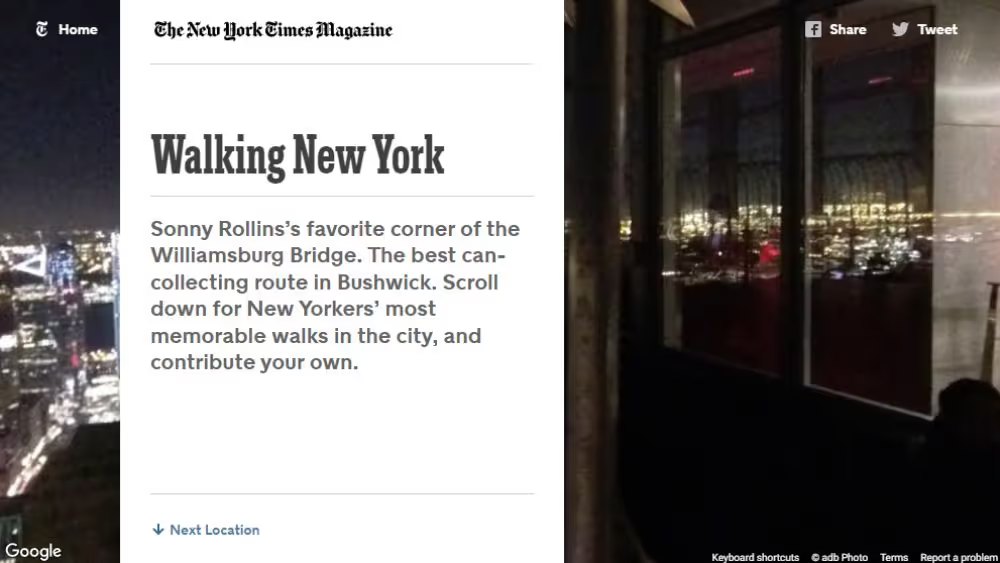
The New York Times Magazine: Walking New York is retained as a historical editorial reference. The associated 2015 project connected walking, the city and visual storytelling. Its lesson for a smaller business is not to reproduce a major publisher’s production scale. It is to choose a presentation that helps the reader understand the subject and gives the imagery a meaningful role.
When a story benefits from place, sequence or perspective, an ordinary list may not be the strongest form. Even then, the basic explanation should remain available without requiring the reader to discover a hidden interaction. The screenshot below records the original reference rather than a newly tested virtual tour.
CommUtah: check the reference before copying the claim
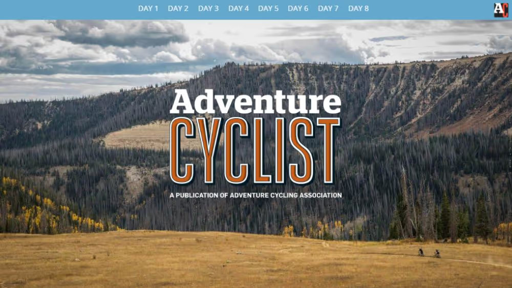
The original link label, American Cycling Association: CommUtah, is preserved, but it points to a “Commute from Heaven” editorial address. That is not enough evidence to describe it as an active Utah event-registration site. The archived Adventure Cyclist image is useful as a visual reference; the earlier claims about current ride listings and race registration are not carried forward.
This is a practical lesson for design research. Record what a reference actually demonstrates, distinguish the publisher from the subject and avoid turning an attractive screenshot into an invented case study. A reference can inspire typography or image treatment without proving anything about conversion or site architecture.
Adobe Creative Types: give interaction a clear purpose
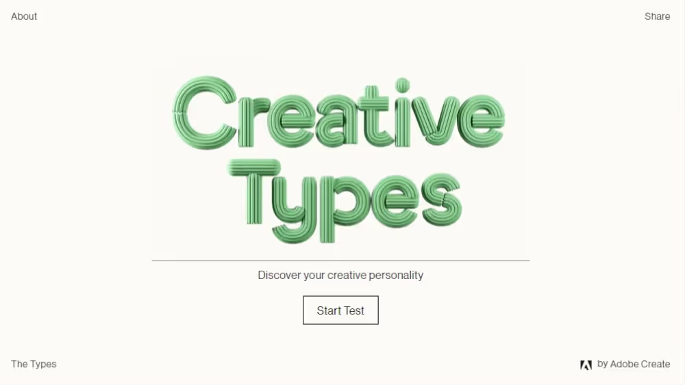
Adobe: My creative type uses a quiz to invite participation around creativity. Adobe has continued to describe Creative Types as an interactive campaign, while individual versions and supporting experiences have changed over time. The archived image belongs to the original reference and should not be read as the current interface.
The transferable idea is a complete interaction: understand the invitation, answer the questions and receive a meaningful result. For a commercial campaign, test whether the result helps the audience or simply provides a reason to collect details. Keep the effort proportionate and make the experience usable without relying on animation alone.
The Seas of Plastic: interaction can explain a relationship
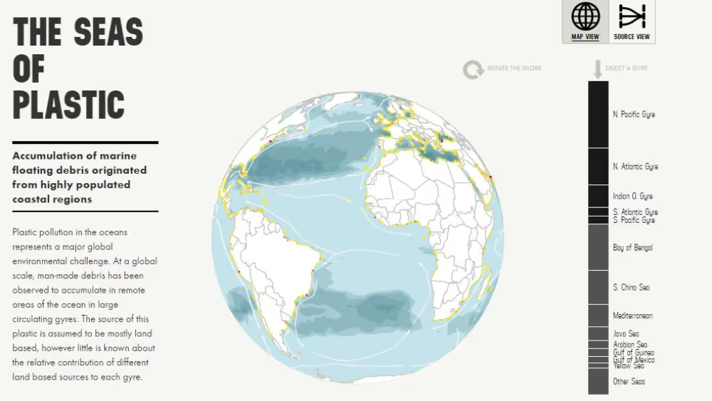
Dumpark: The seas of plastic visualises modelled relationships between sources of floating marine debris and accumulation areas. Its map and source views demonstrate a good reason to use interaction: readers can explore relationships that are harder to grasp from a static list. The project also identifies its underlying research and modelling context.
For an agency article or campaign, that is the useful standard. A chart or interactive view should help answer a question, with a clear explanation of what the data represents. Visual drama cannot compensate for an unclear measure or an unsupported conclusion.
ProPublica: a focused question can organise complex evidence
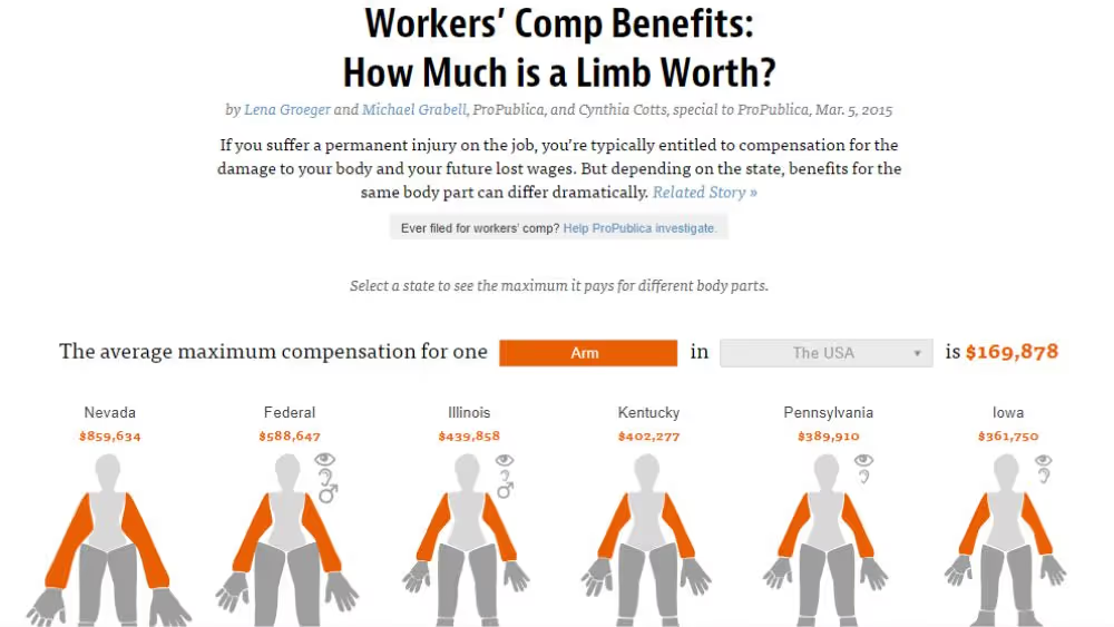
ProPublica: How much is a limb worth is a 2015 reporting project comparing recorded workers’ compensation benefits across US states. The page identifies its authors, data date and methodology. It is a historical journalism example, not current legal guidance or a model for estimating an individual claim.
The design lesson is the connection between a specific question and an explorable comparison. A reader can investigate differences without first reading a large undifferentiated dataset. The surrounding qualifications matter as much as the graphic: explain the measure, the limits and where the evidence comes from.
Samsung: a product page is not automatically a separate microsite
Samsung: Z Flip phone points to a Galaxy Z Flip3 product address within Samsung’s wider website. It is a useful product-story reference, but its URL alone does not establish a standalone microsite. The retained screenshot shows a different archived Samsung model, Galaxy Z Fold6, so it is labelled accordingly rather than presented as evidence of the Flip3 page.
For your own product, decide which features require visual explanation and which are better stated plainly. Animation can demonstrate a physical behaviour; it should not hide specifications or interrupt the route to a decision. Study that relationship instead of assuming every launch needs its own domain.

Lufthansa: chronology earns a timeline
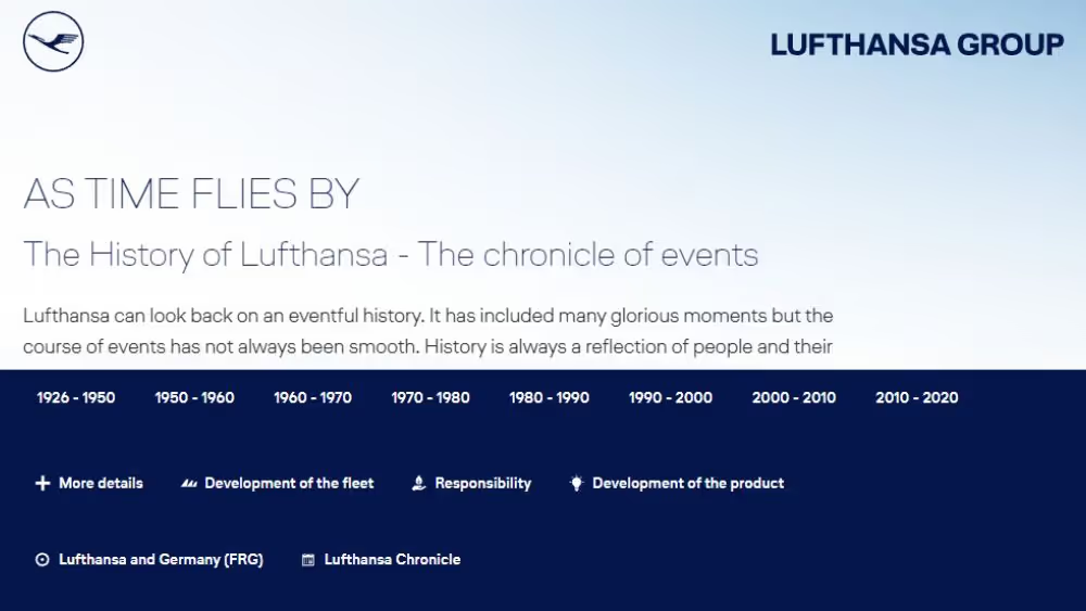
Lufthansa: As time flies by is a chronicle within the Lufthansa Group website. Its sequence of dated events gives the timeline a clear editorial purpose. This is a stronger reason for chronological interaction than applying a timeline to an unordered list of benefits.
A smaller organisation can use the same principle selectively. Present the events that explain a meaningful development and support them with reliable records. Let the reader understand the story without opening dozens of decorative panels. The form should clarify change over time, not simply make the page look more interactive.
Tiffany Blue Book: an image-led collection still needs context
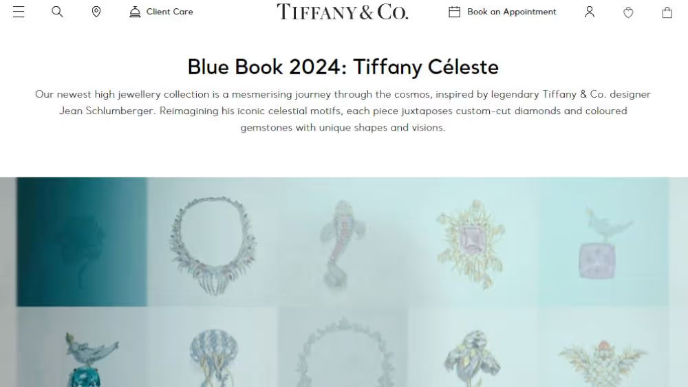
Tiffany & Co.: Tiffany Blue Book links to the 2024 Tiffany Céleste collection. This is a dated collection reference inside the brand’s wider website, not a claim about its latest range. It illustrates how a focused visual world can support a particular body of work while retaining a recognisable connection to the parent brand.
The lesson is proportion. Rich imagery can carry much of a collection story, but readers still need orientation and useful detail. A luxury visual treatment does not remove the need for legible text, clear controls and an understandable next step.
Nike Dream Crazy: distinguish the campaign from its case study
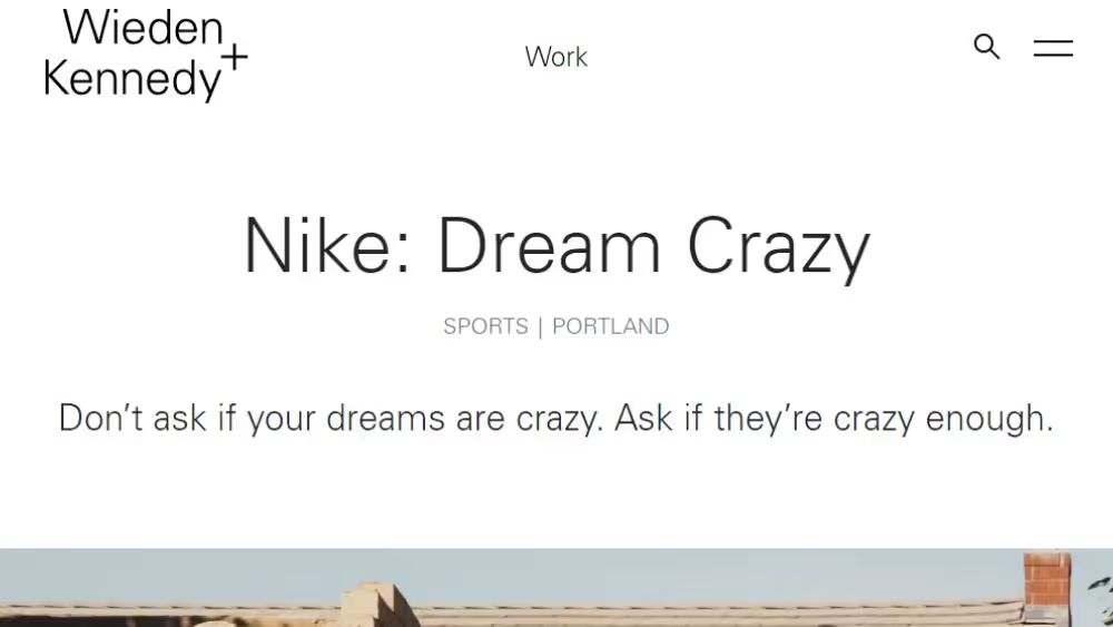
Nike: Dream Crazy is linked through Wieden+Kennedy’s account of the campaign. That page is an agency case-study reference, not evidence that the original campaign existed only as a microsite. It is useful for considering how a strong creative idea connects different pieces of communication.
For a website brief, identify the central message before commissioning video or interactive effects. The campaign’s emotional direction should support the organisation’s actual purpose and audience. Borrowing the surface style of a well-known campaign without its reasoning is unlikely to produce the same coherence.
Spotify Wrapped: relevance gives people a reason to participate
Spotify’s “Wrapped" leads to Spotify’s 2023 Wrapped newsroom material. It is a historical reference to a personalised experience, not the current year’s recap or a generic recipe for a microsite. The important idea is that the content becomes meaningful to the participant because it concerns their own listening.
Personalisation requires useful underlying information and a reason to present it. A small business should not imitate a data-heavy campaign by inventing scores or collecting information it does not need. Start with what the audience can learn from the result, then assess whether the required data and implementation are justified.

Write the brief before choosing a separate site
Begin with one sentence describing the audience and the question the experience answers. A website designed around that question has a clearer basis for content, navigation and interaction. If the sentence is indistinguishable from the main website’s purpose, reconsider whether separation is doing useful work.
Next, outline the content and the intended route through it. Identify the point where a visitor needs the parent brand, a transaction platform or further support. Plan those connections explicitly. Do not let a separate visual identity become a reason to conceal ownership or make essential information difficult to reach.
Develop representative content before adding sophisticated effects. Long headings, real product names and necessary qualifications reveal layout problems early. Include responsive design for mobile users in that work, with attention to touch controls, keyboard access and reduced motion. A desktop presentation is not a complete interaction specification.
Assign ownership for launch and operation. Name the people responsible for approving claims, publishing changes, checking forms and reviewing results. Record the services and accounts the experience depends on. A microsite can be small enough to launch quickly and still important enough to deserve a proper handover.
Finally, decide how it ends or evolves. Set a review point, identify content worth retaining and explain how obsolete offers will be handled. The plan does not need to predict every future campaign; it needs to prevent the site becoming an unmanaged fragment of the business.
Measure the result you actually intended
Separate attention from completion. A person can explore an interactive story without becoming a qualified lead, and a registration click can fail to become a completed booking. Identify the stages that matter to your campaign and check where the available data ends. Do not describe a click as a sale merely because the transaction happens on another platform.
Consider the quality of the audience as well as its size. A highly specific campaign may attract fewer people while answering their questions more effectively. Equally, a popular quiz may reach people who have little interest in the underlying offer. Decide which outcome the project exists to support before choosing the most flattering metric after launch.
Keep the campaign’s context in the interpretation. A change in promotion, season or audience can affect results at the same time as a design revision. If the evidence does not isolate the effect of the design, say so. A useful report explains what happened, what remains uncertain and which practical adjustment is worth testing next.
Make the experience maintainable for its owner
Before handover, ask the future editor to perform a realistic update. Change an event date, replace a speaker, correct a product detail or close registration. The task should be achievable without guessing which duplicated field controls the visible page. Record the steps and the person to contact when the change falls outside ordinary editing.
Review external dependencies too. A video, form or interactive service may be controlled by another account or supplier. Know which parts remain available if a subscription changes and which require continuing support. This does not mean avoiding every external service; it means making the dependence visible enough to manage.
Choose the simplest structure that supports the story
For Fit Design, good web design begins with the relationship between the reader’s task and the organisation’s goals. A microsite is one possible response. A landing page or a well-organised section may deliver the same clarity with fewer continuing obligations.
Choose the separate experience when you can explain its audience, content, distribution and ownership. If its main attraction is simply that it feels new, invest first in improving the structure you already have. The strongest campaign is the one people can understand and use—and that the team can continue to look after.
When a distinct audience, story or interaction benefits from a focused experience that the main site cannot support as clearly. Compare it with a landing page or dedicated section, and plan distribution, maintenance and the end of the campaign.
Assign content, technical and measurement responsibilities. Keep important information consistent with the parent organisation, test key journeys and decide how expired offers or events will be handled.
There is no automatic advantage. Useful content, accessible implementation and distribution still matter. A new domain does not simply inherit the main site’s established search presence, and repeating the same material across sites can create management and relevance problems.
Not necessarily. Teams use the term for different focused experiences, including separate domains, subdomains and dedicated sections. Choose the structure around the audience, content and operating requirements.
Only when the additional exploration or distinct experience serves the task. A focused landing page may achieve the same goal with fewer ongoing responsibilities. Neither format guarantees conversions or rankings.



.webp)
Where ideas come to life
We explore various aspects of modern life, offering valuable perspectives on the latest trends, and helpful tips.

