

Stay updated with our letter
Valuable perspectives on the latest trends and tips.
.avif)


3 Best Financial Service Website Design | Quick Guide


A financial-services website should help people understand an offer, find the information that matters and recognise the next appropriate step. Visual polish supports that work, but it cannot replace clear explanations, accurate claims or a dependable route to help.
This guide looks at financial website design through three public examples and the practical decisions behind a useful site. The examples are design references, not a ranking of financial products or a recommendation to choose a particular provider.
For a smaller firm, the challenge is rarely to reproduce the scale of a major bank's website. It is to explain a focused service well, support the right audience and make the content manageable as the business changes.

Define the service and the visitor's task
Financial services include different kinds of organisations and activities. A bank, an insurance intermediary and an advisory business do not need identical pages or enquiry journeys. Start with what the visitor is trying to understand or do.
A prospective client may want to know whether the firm handles their situation, how the process works and what information they need before making contact. An existing customer may need support or access to an account. Those tasks should have recognisable routes.
Separate general information from personal advice or an application process. The page should not imply that reading a short description determines whether a product or service is suitable for an individual. Make the nature of the next step clear.
This is where web design becomes more than styling. Navigation, content order, forms and supporting information together shape what the visitor understands. A clear layout helps the business communicate without asking the reader to assemble the meaning from scattered fragments.
Use large financial websites as references, not blueprints
Nationwide, Barclays and Virgin Money are familiar names to include in a reference review. Their scale and service range differ from those of a small specialist firm. A large navigation system may be appropriate for a broad organisation while overwhelming a business with a much narrower offer.
Choose a task when studying a reference. Try to find a service explanation, support route or contact option. Note the labels and information needed along the way. That exercise is more useful than deciding a site is good because its homepage looks modern.
Do not infer customer service quality, product suitability or conversion performance from the interface. Those questions need different evidence. A public website also does not reliably reveal its entire technology stack or internal publishing process.
Three website examples to study
1. MoneySuperMarket: organising choices around recognisable subjects
MoneySuperMarket presents routes into areas such as insurance, money and household services. Its public navigation provides a useful reference for grouping a broad set of choices around terms that visitors can recognise.
The design question for a smaller firm is how to make its own range understandable. If visitors do not know the internal name of a service, the navigation may need language that reflects their task or situation. A category should help someone narrow the choice rather than merely mirror the organisation chart.
Keep comparisons clear about their basis. If your site compares services, explain what the categories mean and what information is included. Do not use the appearance of a comparison table to imply a complete market assessment when the content covers only selected options.
2. Halifax: distinguish product exploration from support
Halifax is a reference for reviewing the different tasks a banking website must accommodate. When exploring it, compare the route for someone investigating a product with the route for an existing customer looking for help.
A specialist firm's site can apply the same question at a smaller scale. “Discuss becoming a client” and “Get help with an existing matter” may need different destinations. Sending both groups into one vague form can make the visitor's task and the team's response harder.
Review the labels and confirmation messages in your own journey. A button should explain the action it starts. A contact acknowledgement should describe what happens next without promising an immediate response that the business cannot consistently provide.
3. Lloyds: review information across a complete journey
Lloyds offers another public reference for examining how a broad financial site connects service information and customer routes. Study the sequence of pages rather than judging only the first screen.
For your own site, ask whether a visitor can move from an overview to the details needed for a decision without losing context. A concise introduction can be helpful, but it should lead naturally to fuller information and relevant support.
A design review should also include long text, forms and mobile layouts. A striking homepage cannot compensate for unreadable terms, unclear errors or a confusing next step. Avoid claiming that any site is usable for everyone without testing the relevant audience and tasks.
Make clarity part of the visual design
Typography should make the structure easy to follow. Use a readable body size, comfortable line spacing and clear differences between headings and ordinary paragraphs. Important qualifications should not become difficult to notice because they are smaller or lower contrast than promotional claims.
Colour can help distinguish actions and information, but it should not carry meaning alone. A status or error needs an understandable label. The page should remain usable for someone who does not perceive the colour distinction as intended.
Use images for a reason. A genuine team photograph can introduce the people behind a service, while a useful diagram can explain a process. Generic imagery of wealth or success should not imply an outcome the service cannot promise.
Keep the composition calm without making it empty. Connected explanations, useful subheadings and a small number of purposeful visual elements can create a confident page. A wall of cards may fragment information that is easier to understand as a continuous explanation.
Plan review of claims before the page is built
The FCA's financial-promotion guidance requires communications within its scope to be fair, clear and not misleading, with additional rules depending on the activity and product. Establish the applicable review requirements with the firm's responsible specialists before approving the content.
Where the Consumer Duty applies, the FCA also emphasises information that supports customer understanding. Design work should help people find and understand relevant information, rather than give promotional material prominence while making important context difficult to read.
Keep an agreed record of approved wording and who can change it. If a claim appears in several places, the content structure should help the team update it consistently. A homepage correction does not fix an older version left in a landing page or downloadable document.
Review the presentation as well as the words. The same sentence can be much less noticeable when placed below a large animation or behind an unclear interaction. The final page needs review in context, including on smaller screens.
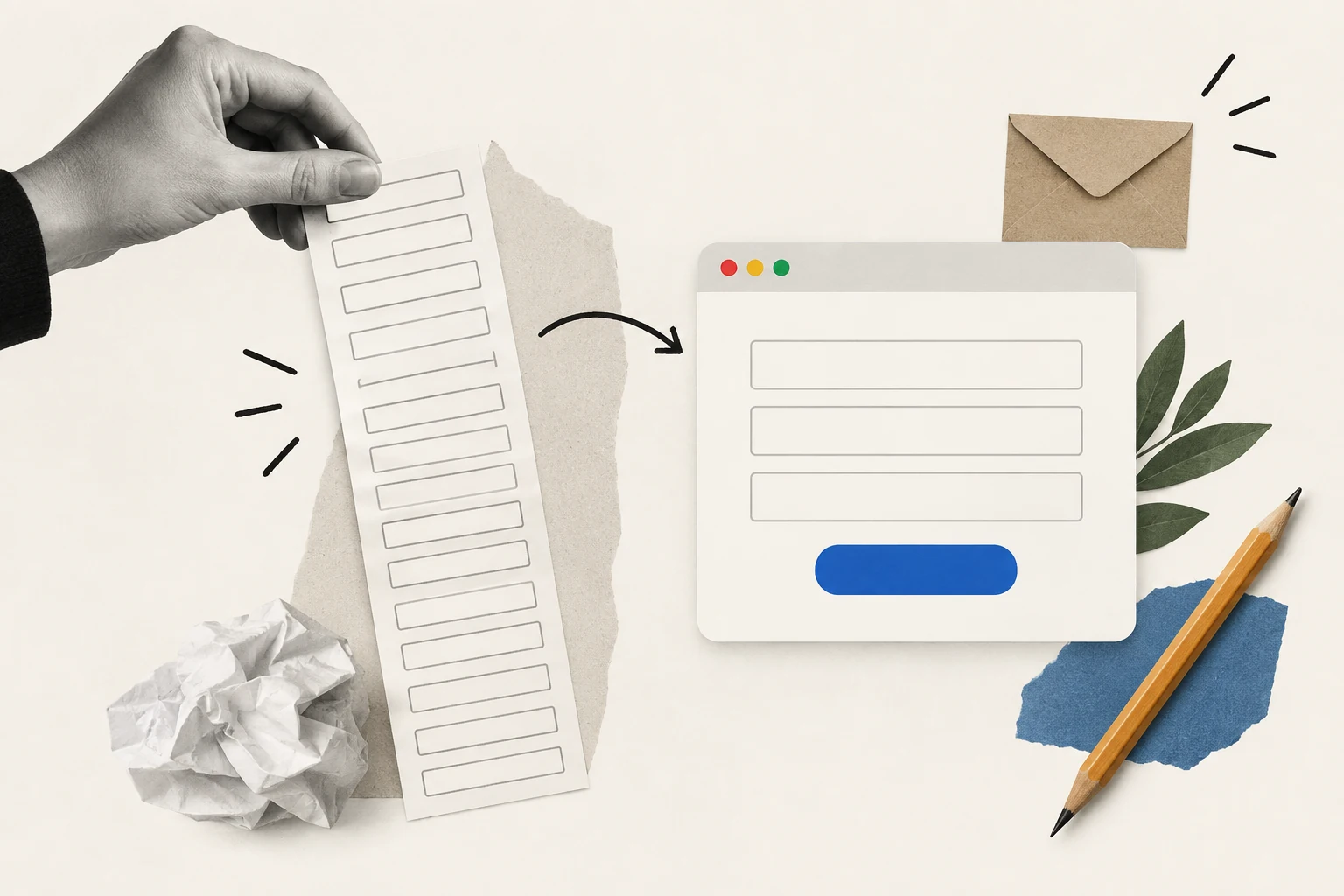
Build an enquiry route that asks for the right information
Prospective clients should understand what the form is for before they begin. Explain whether it requests an introductory conversation, support or an application. Do not collect detailed personal or financial information merely because the form builder makes another field easy to add.
Ask for the information needed to route the request appropriately, and use an approved secure process for later stages where necessary. The firm should define what may be collected, where it is stored and who can access it.
Use clear labels and helpful errors. If a field is required, explain it. If an entry cannot be accepted, identify the problem without deleting the rest of the submission. Test the process with a keyboard and on a phone as well as with a mouse.
Check the destination of the enquiry. A successful confirmation on the website does not prove that the right person received it. The operational process needs an owner, a fallback and a way to identify failed delivery.
Choose the platform around content and responsibilities
A WordPress site may be suitable for some projects, while another CMS or hosted platform may better fit a different team. Employee count alone does not determine the correct technology or the cost of the build.
The amount of custom coding needed depends on the requirements. A focused information site and an authenticated customer application are different scopes. Do not assume a visual website builder covers every integration or security requirement of a financial service.
If evaluating WordPress, ask to see the proposed editing workflow and maintenance arrangement. Make the same request for other platforms. Who can change a service description? Who reviews it? Can the team see a draft before publication? How are corrections tracked?
Account ownership and access recovery should be explicit. The business needs to know who controls the domain, hosting, CMS and connected systems. Essential access should not depend on a single undocumented personal account.
Compare costs through scope, not old price ranges
A financial website budget should distinguish discovery, design, implementation, content preparation, review, integration, testing and handover. Recurring platform and support costs are separate. Compare proposals with the same assumptions before deciding which is better value.
A small brochure site can still require careful content review. A larger application may involve specialist work that a general website package does not include. The number of pages is useful context, but it is not a complete measure of complexity.
| Scope area | Clarify in the proposal |
|---|---|
| Content and review | Who writes, verifies and approves the wording |
| Website implementation | Templates, responsive behaviour and editing controls |
| Integrations | Data flow, failure handling and access responsibilities |
| Ongoing support | Included work, response arrangements and extra charges |
A monthly arrangement does not automatically mean unlimited design work or continuous support. Read the actual scope and confirm what happens when the included allowance is exceeded. Historical promotional prices are not a reliable basis for a current project budget.
Choose an agency or freelancer by the work required
Either arrangement can work when the skills, capacity and responsibilities fit. An agency is not automatically faster or better supported, and a freelancer is not automatically cheaper or less reliable. Assess the proposed people and process.
Ask for relevant work with a clear description of the supplier's role. A portfolio image alone does not show who handled content structure, development or review. Discuss how the team dealt with requirements similar to yours.
Clarify who coordinates feedback and who can make final decisions. A project can slow down when several people give conflicting instructions without an agreed owner. A simple review process helps the supplier deliver a coherent result.
Include continuity in the decision. Understand how another person could take over the site, where documentation is stored and how support is provided when the original designer is unavailable.
Maintain the information as carefully as the layout
Website maintenance includes the accuracy of the content as well as technical upkeep. Service descriptions, contact routes and downloadable material need review when the underlying information changes. Waiting for a full redesign is not an appropriate way to correct outdated details.
Assign owners to important content. A review date is useful only if someone knows what they are checking and what should trigger an earlier update. Keep related pages and documents in the same change process.
Review campaign destinations when planning digital marketing. A message can be accurate in isolation but lead to a page with older or contradictory information. The complete journey should make sense to the visitor.
Measure useful outcomes proportionately. Enquiry quality, successful completion of a support task and recurring points of confusion can guide improvements. More clicks alone do not show that people understood the service or reached the right next step.
Test understanding with a realistic task
Imagine a hypothetical visitor trying to decide whether a firm can help with a particular type of enquiry. Ask them to find the relevant service and explain, in their own words, what happens after they make contact. This can reveal uncertainty that a visual review alone misses.
The visitor might understand the broad offer but assume that submitting a form starts a formal application. If the form only requests an introductory conversation, the page needs a clearer explanation. The problem is not solved merely by making the button more prominent.
Ask what information they would look for before proceeding. Their answer may point to missing process details, unclear eligibility language or uncertainty about who will respond. Use that evidence to improve the content rather than add decorative reassurance.
Review the same task on a phone. Important context can become separated from the action when columns stack or a banner occupies much of the screen. A desktop composition that appears balanced may create a very different reading order on a smaller device.
Keep the findings specific. Record the task, the point of confusion and the proposed change. Avoid claiming that a small informal review proves the website is accessible or understandable for every customer. It is useful evidence for the next improvement, with clear limits.
Finally, check the revised page as a whole. A correction can introduce a new inconsistency if the same information remains different elsewhere. The design, wording and operational next step should agree before the page is approved.
Include downloadable information in the task where it forms part of the journey. The visitor should know what a document contains before opening it, and its wording should agree with the page that links to it. A clearly designed webpage can still leave someone confused if the next document uses different terms or an unexplained earlier version of the service description. Assign an owner to those materials alongside the ordinary website content.
A practical starting brief for a specialist firm
Describe the audience, the services offered and the main questions the website needs to answer. Identify the content that requires specialist approval and the people responsible for it. Include examples of current enquiries that the new site should help route more clearly.
Then map the essential pages and journeys. A service overview, a detailed explanation, information about the firm and an appropriate contact route may provide a strong starting structure. Add features because they support a real task, not because a large competitor has them.
For a Fit Design discussion, that brief connects the visual direction to the business's actual communication needs. The result should feel professional because it is clear, consistent and useful, with imagery and layout that support the explanation.
A financial website earns confidence through the details: accurate wording, understandable choices, readable information and a working route to help. Those qualities deserve as much attention as the homepage composition.
Primary references: FCA guidance on financial promotions and FCA guidance on consumer understanding. The responsible firm should determine which requirements apply to its activities and approve the final communication.
Clear explanations, accurate information, readable layouts and a dependable route to the appropriate next step. The design should support the visitor’s task and the firm’s content-review process.
Choose around content, editing, integrations and operational responsibilities. A public information site and an authenticated financial application have different requirements. Test the proposed setup against the actual scope.
Correct information when it changes and review important content through an assigned process. Technical maintenance and content accuracy should not wait for a complete visual redesign.
The cost depends on content, design, integrations, review and support. Compare equivalent scopes and separate the initial project from recurring platform and maintenance costs.
No. They are references for studying website information and journeys. Product suitability, financial outcomes and customer service quality require different evidence and are not ranked by this design guide.



.webp)
Where ideas come to life
We explore various aspects of modern life, offering valuable perspectives on the latest trends, and helpful tips.

