

Stay updated with our letter
Valuable perspectives on the latest trends and tips.
.avif)


9 Important Website Functionalities Vital For Ranking



A website can contain all the familiar ingredients and still be difficult to use. The menu exists, but its labels are vague. The contact form looks polished, but its error message leaves someone stranded. The service page loads quickly, yet never explains whether the business can help.
Website functionality is the way those parts work together. For a business owner, the useful question is whether visitors can understand the offer, find the information they need and complete an appropriate next step. Search visibility matters, but adding features is not a recipe for rankings. A footer, a chatbot or structured data does not create a ranking entitlement.
The nine areas below connect the original essentials of website design with practical checks you can make. Some help search engines discover and interpret content; others help people use it. Both deserve attention, without confusing a better user experience with a guaranteed search position.
1. Responsive design that holds up with real content
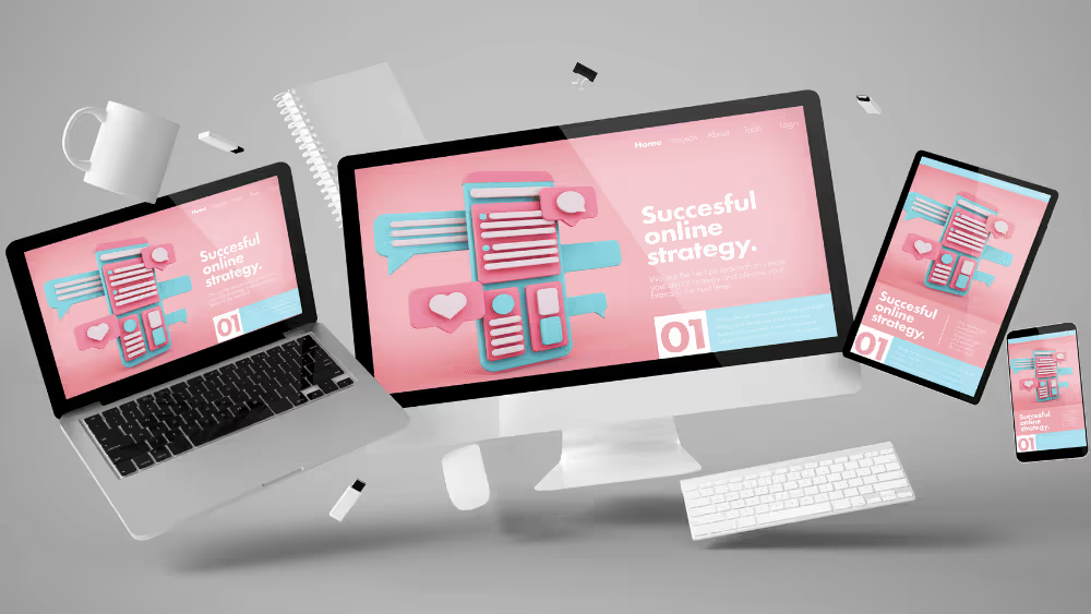
responsive website design means more than shrinking a desktop layout. The content needs a sensible order on a narrow screen, controls need enough space to operate, and important information must remain available when there is less room. A page that fits inside the viewport can still be uncomfortable to read.
The earlier version of this article referenced a 2023 report by Statista about mobile traffic. Treat that as historical context, not a current measurement of your audience. Review your own visitors and enquiries where you have reliable data, while remembering that every supported device deserves a usable experience.
Try the page with your longest service name, a paragraph that is twice as long as the demo copy and an image with a different shape. Watch tables especially: readable columns with horizontal scrolling are preferable to squeezing ordinary words into fragments. Keep normal word wrapping in headings and table cells; reserve aggressive breaking for unusually long addresses or other unbroken strings.
Google’s Material Design guidelines are one design reference, rather than a substitute for checking the accessibility standard relevant to your project. WCAG 2.2’s minimum target-size criterion generally uses 24 by 24 CSS pixels with defined exceptions, including spacing; larger controls can still be easier to use. Do not turn a remembered design-system number into a universal compliance claim.
2. Performance that supports the actual journey
A fast opening screen matters, but performance continues after it appears. Can the menu respond promptly? Does the layout jump when an image arrives? Does a booking widget make the page difficult to use? Test the actions people need, not just the first impression.
Begin with measurement. Large images, unnecessary scripts and slow responses can each create problems, but they require different fixes. Compressing an already efficient image will not repair a delayed third-party service. Likewise, removing a useful feature without understanding the cause may reduce functionality while leaving the bottleneck in place.
Caching can reduce repeated work when configured appropriately. The linked guide to clearing cache in messenger apps concerns a user’s device and a particular application; that is a different task from configuring browser or server caching for your website. Ask the person maintaining the site which resources can be cached and how updates will reach visitors.
Google uses Core Web Vitals within its ranking systems, but good scores do not guarantee a top position. Performance work should have a concrete purpose: making the page and its interactions dependable for the people using them.
3. Visual design that makes the information easier to understand
Design gives a page emphasis and order. A reader should be able to distinguish the main explanation, supporting detail and next action without decoding a different visual language in every section. Consistent typography and spacing help, but consistency does not require every paragraph to sit inside an identical card.
Use a bespoke web design process to connect the presentation to the content. A detailed comparison may need a table. A project story may need a generous image and a caption. An important qualification may need a short, clearly labelled note. Choose the treatment because it helps the reader, rather than because the component is available.
Contrast and legibility need attention across all states, including links, hover styles, disabled controls and form errors. Avoid relying on colour alone to communicate meaning. A red border without an explanation may show that something is wrong without telling the visitor how to fix it.
Review a representative long page as well as the homepage. If the layout becomes repetitive or exhausting halfway through, adjust the hierarchy and pacing. The website needs to support sustained reading, not merely produce an impressive opening screenshot.
4. Navigation that follows the visitor’s questions
A useful menu reflects the tasks and subjects people recognise. Internal department names or clever labels can make sense to the business while leaving a prospective customer unsure where to go. Use language that helps someone predict the destination before clicking.
There is no universal rule that every destination must sit within three clicks. A short, ambiguous route can be harder than a slightly longer route with clear choices. Test whether someone can find a relevant service, understand its scope and reach the appropriate contact route without asking for help.
For larger sites, breadcrumbs, search and related links may help people orient themselves. Add them where they solve a real navigation problem. Search needs useful results and a helpful empty state; a search box that rarely finds the expected content introduces another dead end.
Keyboard operation belongs in this review. Check that the menu opens, the focus remains visible and the visitor can move through the options without a mouse. If a panel or dialog opens, its behaviour should remain understandable when entering and leaving it.
5. Content that answers the question behind the visit
A strong SEO strategy begins with useful content and a clear understanding of the search intent. A service page should explain the offer, who it suits, what is involved and what a buyer needs to know before making contact. Repeating a keyword cannot make up for those missing answers.
Write at the level of detail the decision needs. A short definition may be enough for a simple term; a platform comparison needs trade-offs, constraints and examples. Avoid length for its own sake, but do not cut the explanation so aggressively that the reader must leave to understand the subject.
Originality often comes from specificity. Describe a realistic scenario, explain why an option suits it and identify what could change the recommendation. Label hypothetical examples clearly. If you quote a client or report a result, keep the attribution and evidence rather than turning an illustrative number into an apparent fact.
Review older articles for claims that age quickly: software capabilities, prices, regulations and search features. Useful maintenance is more than changing a date. It means checking whether the advice still helps someone make the decision the page promises to address.
6. A homepage that establishes the business quickly
The homepage should help a new visitor understand what the organisation does and where to go next. It does not need to contain the entire website. A clear introduction, relevant evidence and sensible routes into the main services can do more than a long collection of loosely connected promotional sections.
If you are comparing startup website builders, evaluate the content structure as well as the design choices. Will the platform let you present the information your buyers need and maintain it reliably? A visually flexible tool is only useful if the finished page explains the business.
Give photographs, illustrations and motion a role. Show the work, explain a process or establish the context. Avoid making essential text depend on a carousel slide that may change before someone finishes reading. A homepage can have personality while allowing the visitor to remain in control of the pace.
7. A footer that finishes the page usefully
The footer provides a familiar place for supporting navigation and business information. It can help someone who has reached the end of a page find contact details, related services or policies. Treat it as a useful part of the journey rather than a place to store every remaining link.
Keep the information accurate and the grouping clear. A visitor should be able to distinguish a service link from a policy or social profile. If you show an address, opening hours or a company detail, make someone responsible for maintaining it when the business changes.
Do not use the footer as a shortcut for search optimisation by adding long lists of repeated keywords or irrelevant location links. A focused set of destinations is easier to use and maintain. Check contrast and spacing here too: small, faint text can make important information unnecessarily difficult to read.
8. Structured data that describes what is really on the page
Structured data gives search systems a machine-readable description of certain information. The appropriate type depends on the page and the feature you are trying to support. It should match visible, accurate content rather than introduce claims the visitor cannot verify.
Do not add a markup type simply because another site uses it. Check the current search documentation for eligibility and supported features, then validate the implementation. A successful validation result establishes a technical check; it does not promise that a particular search appearance will be shown.
For an agency project, ownership matters after launch. If the visible business information changes but the structured data does not, the two can drift apart. Prefer an implementation that draws from the same maintained content where practical, and include structured data in reviews when relevant pages change.
9. Internal links that help people continue
An internal link should offer a useful next destination in the context of the current page. A reader considering a service may need a relevant example, an explanation of the process or a contact route. Link where that connection makes sense, with text that describes what the reader will find.
Google’s guidance recommends crawlable links, generally an anchor element with an href, and descriptive anchor text. This helps search systems discover pages and gives people a clearer route through the site. Avoid adding links solely to hit an arbitrary quota.
Review existing links when refreshing an article. Keep valuable destinations intact, check whether the surrounding explanation is still accurate and investigate broken or unexpected routes. For a redesign, record the existing URLs before implementation so that navigation changes do not accidentally disrupt established pages.
Optional features should earn their place
Live chat can help when someone is available to answer the questions visitors ask. It can frustrate when it promises immediate help but leaves messages unanswered. Before adding it, define the support hours, response expectations and fallback route, and review how it behaves on a small screen.
The same reasoning applies to calculators, sliders and interactive sections. They should clarify a decision or make a task easier. A simple explanation may be the better choice when an interaction hides information or adds work without improving understanding.
Test the journey, then use tools to investigate
Start with a realistic task: find a suitable service, check an important detail and submit an enquiry. Try it on a phone and with a keyboard. Record the point where the experience becomes unclear or stops working, rather than collecting a long list of scores without context.
| What you notice | What to investigate |
|---|---|
| Important content appears late | Loading behaviour, large assets and third-party dependencies |
| A visitor cannot complete a form | Labels, validation, error recovery and message delivery |
| A menu works only with a mouse | Keyboard operation, focus and control semantics |
| A page does not answer the enquiry | Search intent, missing detail and the next useful destination |
PageSpeed Insights can help investigate performance, including field data where available and laboratory diagnostics. WebPageTest offers another way to examine loading behaviour under chosen conditions. Compare like-for-like tests, and use the findings to identify work rather than treating a single score as the whole experience.
Accessibility tools such as WAVE can identify some issues and support a human review, but they cannot certify that a page is accessible. Combine automated checks with keyboard testing, content review and appropriate assistive-technology testing. Recheck the affected journeys after changes, including the failure states that a successful demonstration can hide.
When briefing Fit Design, bring the pages and tasks causing difficulty, alongside any reliable performance or enquiry evidence. That gives the project a concrete starting point. The goal is a website whose information, design and functionality work together for the people who need it, with search visibility supported by a sound, useful foundation.
Prioritise the tasks visitors need to complete: understanding the offer, finding relevant detail and making an enquiry, booking or purchase. Support those tasks with readable content, dependable performance and accessible controls.
Adding features does not guarantee rankings. Useful content, crawlable navigation and a sound page experience support the site, but each feature should have a practical purpose for its users.
A contact form that explains what is required, identifies errors clearly, preserves valid input and confirms a successful submission supports the complete task. Test where the message goes as well as what the visitor sees.
Follow realistic journeys on representative devices and with a keyboard. Test successful and failed form submissions, menus, links and third-party services. Use diagnostic tools to investigate specific problems and repeat the affected checks after repairs.
No. Automated tools can identify some issues and assist a review, but they do not cover every accessibility requirement. Combine them with appropriate manual and assistive-technology testing.


.webp)
Where ideas come to life
We explore various aspects of modern life, offering valuable perspectives on the latest trends, and helpful tips.

