

Stay updated with our letter
Valuable perspectives on the latest trends and tips.


8 Best Web Design Tools For Web Designers | Beginners Guide



The best web design tool is the one that helps you complete the next part of the job. Planning a site, designing an interface, preparing an image and publishing a working page are different tasks. A useful beginner’s toolkit covers those tasks without turning every project into a collection of subscriptions.
It is easy to mistake a polished mockup for a finished website. The layout may look convincing while the mobile behaviour, content editing and enquiry delivery remain unresolved. Choose software with that distinction in mind: a design tool helps describe the experience, while the implementation has to make it work.
This guide reviews eight practical options and explains where website builders, content tools and testing fit around them. Product details were reviewed in September 2026. Check the supplier’s current plan and requirements before purchasing; old monthly prices are a weak basis for a decision when products and licensing change.
Some linked resources are commercial or affiliate links. The comparison is organised by the work each tool supports, not by a promise that buying more software produces a better website.
Build a small toolkit around the workflow
Begin with the information. What does the visitor need to understand, which pages answer those questions and what should happen next? A rough sketch or content outline can resolve more uncertainty than an elaborate visual treatment. Move into detailed interface work once the structure has something meaningful to communicate.
Then distinguish the assets from the interface. A photo editor can prepare an excellent hero image without defining how the page responds to a narrow screen. A vector application can create an icon without establishing the button’s keyboard behaviour. Each tool contributes something; none removes the need to connect those decisions.
| Task | Useful tool category | Check the result |
|---|---|---|
| Plan content | Sitemap or outline | Does every page have a purpose? |
| Design the interface | Layout and prototyping | Does real content fit? |
| Prepare imagery | Photo or vector editor | Is the export useful at size? |
| Publish and verify | CMS, builder and browser | Does the complete task work? |
You do not need all eight tools below. Choose one main interface environment, the asset tools your work requires and an implementation route. Add specialised software when a real limitation appears. Learning a coherent workflow usually produces more useful progress than repeatedly starting again in a new application.
Keep the underlying web concepts in view
HTML describes the structure and meaning of page content; CSS controls its presentation. They are languages used in the implementation, not competing graphics applications. Even when a visual builder produces the code, understanding headings, links, forms and responsive layout helps you make better decisions in the editor.
For example, a heading should describe the section that follows it, not simply provide a convenient large font. A link should lead to a destination, while a button should perform an action. A screenshot can make those elements look identical without revealing the distinction. The working page needs the right structure and behaviour.
Learn those concepts alongside the software rather than postponing them until something breaks. They make it easier to communicate with a developer and to identify when a visual shortcut creates an awkward result. You do not need to master every framework before designing a page, but you should understand what your design is asking the browser to do.
1. Photoshop: prepare the image, not the entire website
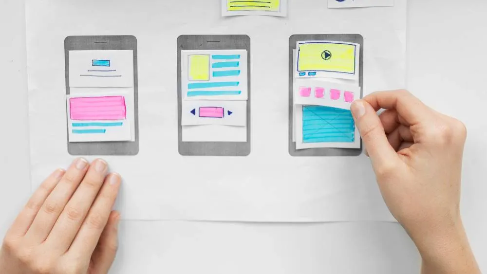
Adobe Photoshop is useful for detailed photo editing, compositing and image-based artwork. For web work, that might mean preparing consistent product photographs, refining a crop or creating an editorial visual that fits the page’s purpose.
Learn layers, masks and export settings through a small real task. Keep an editable source and export a version suited to its display size. Review the result inside the page: an attractive full-resolution image can become an oversized download, while an aggressive crop can remove the detail the reader needs.
Photoshop can depict an interface, but a static canvas does not establish responsive behaviour or accessible interaction. Use it for the work it does well, then define the layout and states in an appropriate interface or implementation environment. The distinction avoids spending hours perfecting a picture of a page that is awkward to build.
Asset handling is part of this process too. If a resource arrives in a compressed archive, guidance on how to unzip RAR files on Mac can help you access the files. Keep the source, licence information and exported web assets organised so the next person can understand what belongs in the project.
2. Sketch: a focused interface environment for Mac-based design
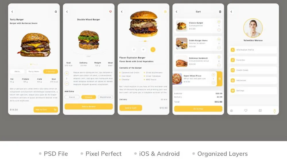
Sketch supports interface design with reusable elements and a dedicated Mac application. Its browser-based collaboration and viewing features mean the distinction is more precise than simply calling the whole service “Mac-only”. Check what your designers, reviewers and developers each need to do.
For a beginner, a useful exercise is to build a small set of related screens and change one shared component. That reveals whether the document is organised for maintenance or merely arranged to look finished. Name the parts clearly and use realistic content so the design can survive ordinary revisions.
Evaluate the handover as well as the editor. Can collaborators inspect the necessary details, leave understandable feedback and obtain the right assets? Sketch offers different licensing arrangements, including a Mac-only option, so confirm the current collaboration requirements rather than copying an old subscription figure.
3. Figma: connect layout, components and collaboration
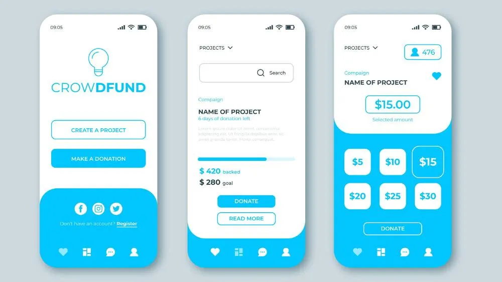
Figma is a practical environment for interface design and prototyping. Components, layout behaviour and shared review can help a team discuss how a page should work before implementation. The benefit comes from the structure of the file and the quality of the decisions, not simply from several people opening the same canvas.
Learn auto layout with real content. Try a longer service name, a missing image and a description that occupies several lines. A design that behaves sensibly under those changes gives the implementation team better guidance than a screen tuned to one ideal example.
Prototype the uncertain parts of the journey. Show how navigation opens, what a selected state means and what happens after an action. A clickable prototype is a discussion and testing tool; it does not prove that the eventual website sends data correctly or works with assistive technology.
Keep the system proportionate. A small marketing site needs consistent typography, spacing and recurring components, but it does not necessarily need an enormous library before the first page is understood. Build reusable decisions where repetition exists and explain any important exceptions.
4. Slickplan: organise the site before polishing its pages
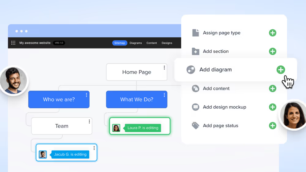
Slickplan focuses on website planning, including sitemaps and content organisation. It is useful when the challenge is deciding what belongs on the site and how pages relate, rather than selecting colours or refining a photograph.
Start by giving each proposed page a purpose. A sitemap filled with labels such as “Solutions” and “Resources” may look orderly while leaving the actual content unresolved. Record the audience question, required material and intended next action so the map becomes a working brief.
For a redesign, include existing URLs and the content that must be retained. Distinguish a new page type from another item using a shared template. That helps the designer, developer and editor understand the effort without treating every box in the map as a completely different layout.
A planning tool does not replace detailed interface design or a CMS. Its value is reducing uncertainty before those stages. If the website is very small, a straightforward document may be sufficient; choose the specialised tool when the structure and collaboration justify it.
5. Penpot: an open-source option for interface design
Penpot provides an open-source environment for interface design, prototyping and collaboration, with hosted and self-hosted approaches. It is worth evaluating when open tooling or deployment control is important to the team, alongside the actual design and review workflow.
Use the same small exercise you would use to assess another interface tool: build a representative page, create a reusable element, revise the content and share it for review. That comparison reveals more than a feature checklist because it tests the work you expect to repeat.
Self-hosting introduces operating responsibilities, so do not confuse control with the absence of maintenance. Decide who manages the service and how collaborators access it. A hosted option may suit a team that wants to focus on design rather than running infrastructure.
This replaces the earlier recommendation to start with InVision. Its design collaboration products were discontinued at the end of 2024, as described in Miro’s update about Freehand and InVision. Adobe XD is also in maintenance mode. Check a product’s current direction before committing a new workflow to an old tutorial.
6. Canva: make supporting assets consistent
Canva can help with presentations, promotional graphics and other supporting visual material. It can be useful when a team needs a repeatable way to prepare assets without requiring every contributor to master a specialist illustration application.
The important choice is the template’s relationship to your content. Replace generic visual cues with material that belongs to the business, keep typography and spacing consistent, and check the export at the size people will actually see. A template is a starting structure, not evidence that the message is finished.
The same discipline applies across channels, including material such as real estate farming postcards. A campaign may use a website, print and social assets, but each has different dimensions and reading conditions. Do not assume that shrinking one composition is enough to make it suitable everywhere.
A graphic of a button is not a functioning website control. Keep interface text and actions in the page implementation where they can behave correctly. Use asset software to support the website rather than flattening meaningful content into an image.
7. Affinity: vector, image and layout work in a changed product
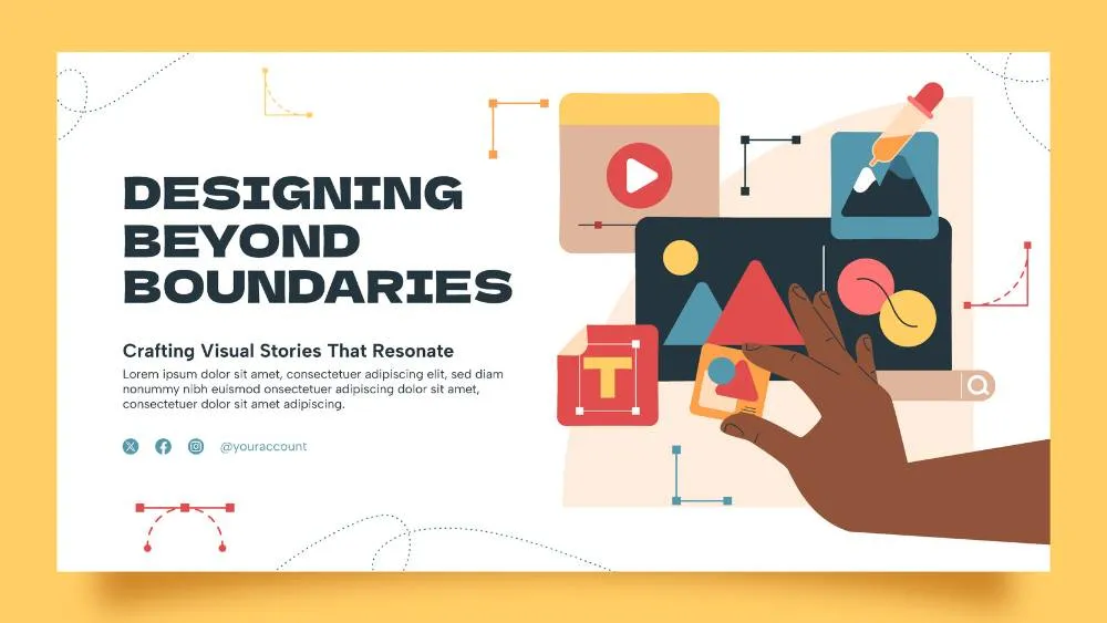
The original article described Affinity Designer as a separate one-off purchase. The current Affinity offering combines vector, photo-editing and page-layout tools in one application, with the core tools available free. Canva premium features have separate requirements, so check the specific capability you intend to use.
For web projects, vector work is useful for icons, diagrams and illustrations that need controlled shapes and clean scaling. Image editing supports other assets. Keep those purposes clear: an illustration should explain or support the content, while an icon needs to remain legible at its actual display size.
Practise by creating a small asset family rather than an isolated decorative image. Check consistent line weight, dimensions and visual balance. Export an appropriate format, inspect it in the browser and retain the editable source. The quality of the handover matters as much as the quality of the artwork.
Older Affinity tutorials can still contain useful design principles, but their product layout and purchasing advice may no longer match the current application. Follow current documentation for setup and distinguish a durable editing technique from a dated interface instruction.

8. Depositphotos: source or generate imagery with a clear brief
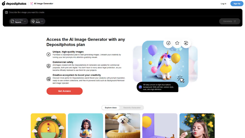
Depositphotos offers an AI image-generation route alongside its wider imagery service. The supplier describes generated images as covered by its Standard licence. Review the applicable terms for your use and keep a record of the asset source rather than assuming every image resource has identical permissions.
Begin with the page’s purpose. A useful brief specifies the subject, composition, space needed for surrounding content and the visual relationship to the article. “Make it impressive” is less helpful than describing what the reader should understand from the image.
Inspect the output carefully. Generated text, interfaces and detailed objects may need correction. Do not present a generated product screenshot, customer result or team photograph as documentary evidence. An editorial illustration can support an explanation without pretending to record something that happened.
Finally, test the crop and load size in the actual layout. A wide hero image and a small supporting figure have different requirements. Keep essential labels and exact data in real text or a deliberately constructed diagram rather than asking a decorative image to carry precise information.
Choose the platform that will publish the website
The tools above mainly help plan, design or prepare content. Publishing requires another decision. There are many website builders, but a convenient first screen is not the whole comparison. Consider editing, content structure, integrations, ownership and the person who will maintain the result.
Wix and Squarespace offer hosted approaches that can suit relatively straightforward sites. WordPress offers a different ecosystem of themes, plugins and hosting choices; Elementor is one visual-building option within that ecosystem, not a synonym for WordPress itself. Confirm the actual setup and responsibilities rather than treating all three routes as equivalent subscriptions.
Shopify is relevant when the main work concerns products, checkout and commerce operations. Drupal can support structured content and more involved requirements, but it should not be described as the easiest choice for every beginner. The appropriate route depends on the project and available expertise.
Webflow can suit a design-led marketing website with CMS content. Assess the current plan against the required collections, editing arrangement and integrations. Knowing the interface-design tool does not automatically mean knowing how to implement a maintainable site on the chosen platform.
For a simple internal or informational page, Google Sites may be worth evaluating. A free tier elsewhere may be suitable for learning, but check the conditions for a public business website, including branding and custom domains. Squarespace offers a trial rather than a permanent free website plan. “Free software” and “a website with no continuing cost” are different claims.
A beginner project that tests the whole workflow
Choose a small service website as a practice brief. Define the audience, write a short service explanation and identify the action a visitor should take. Use a rough structure to decide where evidence and contact information belong before selecting a polished visual direction.
Design a representative page with real text. Include a longer heading and enough content to expose spacing problems. Prepare one purposeful image and a small set of reusable interface elements. Explain what changes on a narrow screen rather than producing a desktop picture and hoping the implementation will work it out.
Ask another person to attempt the task without your explanation. Observe where they hesitate and what they expect to happen. Their difficulty may concern the wording rather than the button style. Use that evidence to revise the page, then repeat the task in the working implementation.
For someone hoping to generate web design leads, this kind of project is more useful evidence than a list of software logos. Explain the problem, the decisions and the checks you performed. Be clear when it is a practice project rather than a client commission, and do not invent commercial results.
Content and SEO tools support editorial judgment
Writing and research tools can help organise material, identify gaps and check consistency. They cannot establish whether a claim is true or whether the explanation actually answers the reader’s question. Read the complete page continuously after using them; a strong collection of fragments is not necessarily a strong article.
NeuronWriter is one example of a content-optimisation product. Treat scores and suggestions as inputs to review, not instructions to repeat every suggested phrase. Keep the original search intent while improving the reasoning, examples and structure. A higher content score does not guarantee a ranking or an enquiry.
Similarly, grammar tools and AI-assisted drafting can accelerate parts of the process without removing responsibility for accuracy and voice. Verify changing product claims from primary documentation, distinguish hypothetical examples from real results, and preserve useful links when refreshing an established page.
Stock libraries and illustration resources can contribute useful assets, but choose them around the article rather than inserting an image at a fixed paragraph interval. A diagram should clarify a relationship; a screenshot should show the relevant interface; a photograph should add context. Decorative variety alone does not create substance.
Testing tools answer different questions
SEO tools and analytics belong in the workflow after implementation as well as during planning. Automated checks can identify problems worth investigating, but they do not replace reading the page, following the links and completing the main task.
A performance report may flag a heavy image or delayed rendering. A content audit may find a missing title or broken link. Behavioural analytics may suggest where people hesitate. Each observation needs interpretation, and different tools can use different measurement conditions. Avoid treating every score as a comparable percentage of website quality.
Test responsive layouts with real content and inspect tables, forms and navigation individually. Check keyboard focus and whether important controls remain understandable without relying solely on colour. An automated accessibility result is useful evidence, not proof that every person can complete every journey.
Keep a short record of the problem, the change and the retest. That turns a report into a working improvement process. Installing another monitoring tool without assigning responsibility for its findings only creates another dashboard that somebody may stop opening.
Compare the cost of the workflow, not one licence
Identify who needs to edit, review, inspect or publish. A team may not need the same type of seat for every person, and collaboration terms can differ from desktop-app access. Check billing periods, asset allowances and the features required for handover before comparing headline prices.
Include the cost of changing tools. Existing libraries, training, file compatibility and client expectations can affect the decision. A free product may be excellent value, but switching still takes time. Conversely, continuing an unsuitable subscription because the team already knows it can preserve avoidable friction.
Test a representative task before committing. Create the same small page, share it with a reviewer and export what the implementation needs. Evaluate the result and the process together. The most relevant comparison is whether the tool supports your work reliably, not whether its feature list is longest.
When professional help adds more than another application
A tool cannot decide the business message, resolve competing stakeholder priorities or guarantee a sound implementation. If those are the problems, additional software is unlikely to be the missing purchase. Look for the appropriate design, content or development expertise.
When considering Fit Design’s Webflow web design work or another supplier, ask for relevant live examples and a clear account of the responsibilities included. The earlier agency price symbols in this article were not a verified market comparison. Compare the actual brief, team, handover and support instead.
For a beginner, the strongest next step remains small and concrete: complete one useful page, explain the decisions and verify the result in the browser. Expand the toolkit when that work reveals a real need. The tools should make good decisions easier to carry through, not become the project themselves.
Choose around the task and your operating system. Start with one interface tool or a suitable website builder, practise with a small real brief and test the result. Ease of opening a template is not the same as completing a dependable website.
Define the content and visitor task before polishing the layout. Choose an appropriate CMS web design approach, use real material and test responsive behaviour and the main interaction in the browser.
Compare editing, content, commerce, integrations, ownership and maintenance requirements. A design application and a publishing platform do different jobs. Confirm current plan limits and costs for the actual setup.
Update information when it changes and maintain the technical setup according to its needs. Review the design when evidence shows a problem with the message, user journey or implementation. There is no universal requirement to redesign every two or three years.
No. HTML describes page structure and meaning; CSS controls presentation. Understanding them helps you make and communicate better interface decisions, including when using a visual website builder.



Where ideas come to life
We explore various aspects of modern life, offering valuable perspectives on the latest trends, and helpful tips.

