

Stay updated with our letter
Valuable perspectives on the latest trends and tips.
.avif)


UI Patterns vs UX Pattern | UI & UX Design Examples



UI patterns help people operate an interface. UX patterns help them complete a wider task. The distinction is useful, but the best design decisions connect the two: a clear control matters because of what it enables someone to do.
A booking form can look excellent and still create a poor experience. Its buttons may be consistent, its fields neatly aligned and its colours carefully chosen. Yet if it asks customers to choose a date before explaining availability, or loses their information after an error, the attractive interface has not solved the underlying problem.
This is where discussions about UI and UX become practical. You need to consider both the visible details and the complete journey, including the moments before and after a person uses a particular screen. Patterns provide a useful starting point, but they are not a substitute for understanding that journey.
For an agency website, the task might be deciding whether a service fits and submitting a useful enquiry. For an online shop, it might be finding an appropriate product and completing an order with confidence. Similar interface components can support both, but the surrounding questions, risks and expectations differ.
The difference between UI patterns and UX patterns
User interface design concerns the controls, content presentation and behaviour through which people interact with a product. User Experience covers the broader experience of using it to achieve a goal. These are related areas of work rather than competing alternatives.
A UI pattern describes a recurring interface solution in context. A disclosure reveals optional information; a search field and results list support finding content; a confirmation dialog asks someone to consider a consequential action. The pattern includes behaviour and states, not just its appearance in a design file.
A UX pattern addresses a recurring task or journey, often combining several components. Reviewing an order before payment, recovering access to an account or returning to an unfinished application involves information, decisions and system responses across more than one control.
The terminology is not perfectly uniform across teams. Some design systems call a search interaction a component, while others describe a broader search pattern. Agree on the problem and the expected behaviour rather than spending the project arguing about labels. The distinction should improve communication, not create another barrier.
| Task | UI question | UX question |
|---|---|---|
| Send an enquiry | Are labels and errors clear? | Are the requested details necessary? |
| Choose a service | Can options be compared? | Is there enough information to decide? |
| Recover access | Is the next action visible? | Can the person recover safely? |
| Complete an order | Are totals and controls readable? | Are costs and conditions clear in time? |
Good UX design connects these perspectives. A research finding should influence the interface, and a component decision should be assessed against the user’s goal. A design can be visually consistent while consistently asking the wrong question.
A component, a pattern and a design system are different things
A component is a reusable part of an interface, such as a text input or notification. A pattern explains how to solve a recurring problem, which may require several components and content rules. A design system brings together foundations, components, guidance and a way to maintain them.
Consider an error message. The component might define typography, colour and spacing. The pattern needs to explain when it appears, what it says, how it identifies the affected field and whether the person’s previous input is retained. The system should help teams apply that behaviour consistently and improve it when evidence reveals a problem.
A folder of attractive buttons is therefore not a complete design system. It is an asset that may form part of one. Without usage guidance, teams can choose the wrong control, hide an important action or produce contradictory versions of the same process.
The GOV.UK component guidance and its separate pattern collection illustrate this distinction. Use them to study how a system connects reusable controls to tasks, rather than copying a government-service appearance into every commercial website.
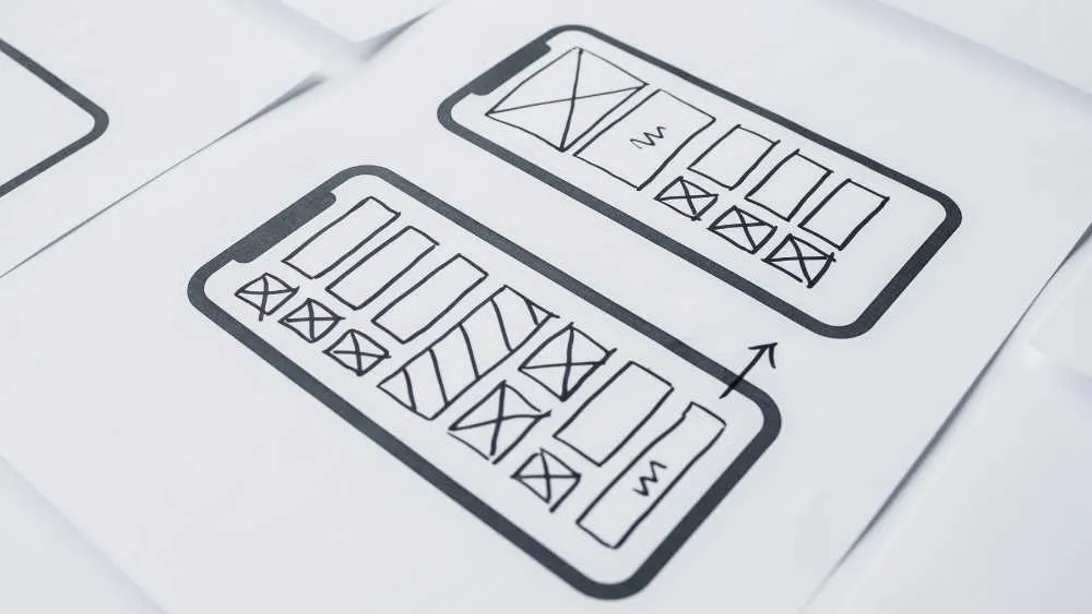
Five interface patterns worth understanding properly
Buttons, menus, fields, layouts and navigation are familiar enough to seem obvious. Their familiarity is precisely why small departures can create difficulty. A visitor brings expectations from other websites, and the interface needs a good reason to contradict them.
Buttons should describe an action
A button performs an action; a link normally takes someone to a destination. They can share some visual characteristics, but the underlying element should match the job. A generic box with a click handler is not automatically equivalent to a native button with established keyboard behaviour.
Use labels that describe what happens next. “Request a proposal” and “Buy now” create different expectations. A primary action should be visually clear, while secondary actions remain available without competing equally for attention. Avoid making every link look like the most important button on the page.
Design the states as well as the resting appearance. A submitting button needs to communicate that work is happening, and a failed request needs a recoverable outcome. Preventing repeated submissions is useful; leaving a button permanently disabled after an error is not.
Menus need understandable choices
A menu organises available destinations or actions. The challenge is partly visual, but its labels and grouping often matter more. Internal department names may make sense to a business while leaving prospective customers unsure where to go.
For web design, test navigation with real tasks: find a relevant service, inspect a project and make contact. A small service website may need a straightforward set of links. A large catalogue may require categories, filters and search. Neither benefits from an arbitrary rule that every menu must contain the same number of items.
Check how the menu opens, how it closes and where keyboard focus goes. On mobile, consider whether a long submenu pushes important choices out of view. A desktop megamenu copied into a tiny panel rarely preserves the original experience without further design work.
Form fields should reduce uncertainty
A field needs a clear label, an appropriate control and enough guidance to prevent predictable mistakes. Placeholder text can illustrate an answer, but it should not be the only label because it disappears when someone types.
Choose fields around the information you actually need. A required phone number adds friction if the team never calls at that stage. A longer project description may be useful if it helps route an enquiry. The right form is not necessarily the shortest; it is the one whose questions make sense to the person completing it.
Error messages should explain what needs correcting. Preserve the other answers when one field fails. If a submission succeeds, say what happens next accurately, without inventing a response-time promise the business cannot keep.
Layout should follow the content
A grid can help compare short, parallel items. It becomes a poor choice when each cell contains several paragraphs, a list and a qualification. The result is a set of tall columns that makes reading harder and creates uneven gaps between items.
Use open sections for developed explanations, tables for concise shared attributes and cards for short self-contained summaries. These are different reading tasks. Changing every paragraph into a panel adds decoration without improving the organisation of the argument.
Responsive layout should preserve that logic. Do not simply shrink a desktop composition until every item technically fits. Let the content reorganise at the point where its reading measure, labels or controls become uncomfortable.
Navigation should show location as well as direction
Breadcrumbs, pagination and contextual links solve different navigation problems. Breadcrumbs can explain hierarchy; pagination separates a collection into manageable pages; a contextual link connects related information at the moment it becomes useful.
Choose the pattern around the structure. A one-page service site does not need breadcrumbs merely because an ecommerce site uses them. An extensive knowledge base needs more than a “back” button that depends on where the visitor happened to arrive from.
Keep selected and current states understandable without relying solely on colour. A person should be able to identify where they are, what choices remain and how to return to a useful point in the journey.
Where the UX pattern changes the whole journey
Imagine a business asking people to book a consultation. The first design shows a calendar immediately, followed by contact details and a confirmation screen. That may work, but only if visitors already understand the service, its eligibility conditions and any cost.
If those questions remain unanswered, the journey needs more than a better calendar. Explain the purpose of the session before asking for a time. Show relevant availability, collect only the necessary details and make the confirmation useful. If a visitor needs to reschedule, provide an understandable route.
The UI patterns remain important throughout. The calendar must be operable, the fields readable and the confirmation clear. The UX pattern connects them into a process that respects the visitor’s expectations and the business’s operating requirements.
Worked example · hypothetical
Improve the enquiry before shortening the form
A consultancy receives enquiries that are often outside its service area. Removing the location field might make the form shorter, but it would not solve the mismatch. A better first experiment could be explaining the service area near the offer and asking for a location only where it helps assess fit.
The UI work clarifies the field and its guidance. The UX work changes when the relevant information appears and why it is requested. Evaluate the quality of resulting enquiries as well as how many people submit.
Research methods and design principles are not patterns
Card sorting, Fitts’s law, Hick’s law and Gestalt principles are often mixed into lists of UX patterns. They can inform a design, but they are not interchangeable with an interaction pattern such as account recovery or progressive disclosure.
Card sorting is a research method that explores how people group and name information. It can inform navigation, especially when a team’s internal categories do not match its audience’s language. Its findings still need interpretation and validation in the actual site structure.
Fitts’s law concerns movement towards a target in relation to its size and distance. In interface work, it can prompt useful questions about awkward controls or closely spaced actions. It does not mean every button should be made enormous without regard to the rest of the task.
Hick’s law relates choice time to the information involved in a decision under particular conditions. It is not a universal instruction to remove options. Clear grouping, familiar labels and the user’s knowledge affect real interfaces. Hiding a necessary choice can make a task longer rather than simpler.
Gestalt principles describe aspects of visual perception, including how proximity and similarity influence grouping. They can explain why a label appears associated with the wrong field, or why two unrelated actions look connected. Their practical value comes from observing the actual layout.
Affordances and signifiers are also useful concepts. A control needs to communicate how it can be used. A button’s shape, label and state can suggest an available action, while an unlabeled icon may leave people guessing. Test whether the cue is understood rather than assuming a familiar shape is universal.
Move from a question to a tested implementation
A productive process starts with a question: what prevents the person from completing the task? The team can then gather evidence, explore alternatives, prototype the uncertain parts, test them and implement the strongest approach. The stages overlap; research does not become irrelevant once a visual design exists.
When a designer creates a proposed interface, the level of detail should match what needs testing. A rough wireframe can reveal whether information is in a sensible order. A more detailed mockup can explore visual hierarchy. An interactive prototype can test a sequence of actions and responses.
These artefacts are related but different. A wireframe concentrates on structure. A mockup communicates a visual proposal. A prototype simulates behaviour to some degree. None automatically proves that a finished website will perform well or support assistive technology correctly.
For a complex interaction, include realistic content and failure states in the prototype. Ask participants to attempt the task without being told the intended route. Observe what they do and where they hesitate; their behaviour may reveal a problem that a preference question misses.
Digital design services connect those decisions to implementation. Handover should describe the behaviour, content rules, responsive changes and accessibility expectations. A screenshot cannot tell a developer whether a dialog closes on Escape or where focus returns afterwards.
Choose tools for the uncertainty you need to resolve
Figma, Sketch, Axure, Justinmind and other prototyping tools offer different ways to explore interfaces. Their names matter less than whether the chosen method can represent the behaviour you need to evaluate. A basic clickable prototype may be enough for navigation; a conditional workflow may require something more expressive.
Tools mentioned in older resource lists, including Flinto, Marvel or Adobe XD, should be checked for current availability and support before a new project depends on them. Do not assume an old recommendation describes the product’s present direction. Existing files may still be useful even when a tool is no longer a sensible default for new work.
Balsamiq-style low-detail wireframes can help a team discuss structure without getting distracted by colours. Behaviour analytics tools can reveal where people interact with a deployed site, but they do not explain every intention or replace a conversation with users. Choose the evidence needed for the question.

Build a pattern library people can actually use
Start with patterns that recur in real work. Name each one by the problem it solves, document when it is appropriate and explain when to choose something else. Include realistic examples rather than only perfectly short placeholder text.
A useful entry should describe content, behaviour and states alongside appearance. For an enquiry form, that includes labels, required-field guidance, validation, submission feedback and recovery. For a comparison table, it includes headers, cell content limits and small-screen behaviour.
Connect the design asset to the implemented component where possible. If the Figma version and website version diverge, the library can create false confidence. Someone needs responsibility for reviewing changes, maintaining the documentation and retiring patterns that no longer work.
Before adding a pattern, answer four questions:
- Which recurring task or problem does it address?
- What content and behaviour does it require?
- What happens when the input, screen or system state changes?
- What evidence supports using it in this context?
You do not need to create a programming class to document a design pattern. That advice confuses interface design guidance with a particular software implementation technique. A pattern can be documented with written guidance, examples, design assets and appropriate code without imposing one programming structure.
Five design-system references, with the right context
Established systems can teach useful lessons about consistency and documentation. They should be treated as references with particular audiences and platforms, not universal catalogues of answers. Borrow the reasoning carefully and test its relevance to your own project.
Google’s Material Design
The original reference, https://material.io/, points towards Google’s design guidance. Study how components, states and interaction rules work together. Applying the visual language to a brand without considering its identity is a separate choice, and not automatically the right one.
Apple’s Human Interface Guidelines
https://developer.apple.com/design/human-interface-guidelines/guidelines/overview is the existing Apple reference. Platform conventions matter because people bring expectations from the devices they use. A native-app convention still needs interpretation before it becomes a suitable website interaction.
Microsoft’s Fluent resources
The Fluent reference at https://developer.microsoft.com/en-us/fluentui is useful when exploring a coherent interface language and implementation resources. Review the relevant version and platform rather than combining unrelated generations of components into a supposedly consistent system.
Amazon’s Fire tablet guidance
The older reference https://developer.amazon.com/docs/fire-tablets/ft-ux-specifications.html is platform-specific. Its value is in considering device constraints and conventions. It should not be presented as a general-purpose web pattern library or assumed to cover every current Fire experience.
Adobe’s design-system resources
The existing link https://helpx.adobe.com/uk/support.html is a support destination, not itself a complete design system. Adobe’s Spectrum resources are a more relevant starting point for studying its interface guidance. Look at how typography, spacing and controls operate as a system instead of collecting isolated visual details.
Read interface examples critically
The examples below are prompts for analysis, not a current usability ranking. Websites change, and a polished screenshot cannot establish accessibility, reliability or commercial results. Review the actual journey you intend to learn from before making a recommendation based on an example.
Cognito appeared in the original article as an illustration-led interface reference. The useful question is whether the imagery explains the offer or merely attracts attention. Motion can support recognition, but it should not delay the basic message or make the controls harder to operate.
Dropbox provides a context for examining familiar file-management tasks. Consider how naming, hierarchy and state help someone understand where a file is and what an action will do. Do not assume that a pattern is intuitive simply because experienced users of a similar product recognise it.
Delassus Group is a brand-storytelling reference. When reviewing a video-led site, ask whether a person can understand the business without watching the entire film. Supporting text, navigation and playback control matter as much as the production quality.
The link labelled Clip leads to Clip Studio, a creative-software context. Tools for experienced creators may justify denser interfaces than a simple enquiry page. Assess discoverability, workspace organisation and progressive learning against the audience’s actual work.
MailChimp offers a context for reviewing how a product explains itself and directs different audiences. Study whether the headline, supporting information and next action agree. A clear landing-page composition is useful, but the onboarding and subsequent task flow still require separate assessment.
Look beyond the first screen in UX examples
PayPal can be considered through transaction-related questions: are the amount, recipient and consequence understandable before confirmation? Treat those as evaluation questions rather than claims that every current PayPal journey achieves the same result.
Duolingo illustrates the kinds of decisions involved in repeated learning activity. Progress, feedback and reminders can influence motivation, but an engaging interface does not by itself establish learning effectiveness. Consider whether the pattern supports the person’s goal or mainly encourages another session.
Tripadvisor is a useful context for search, filtering and comparing travel options. The challenge is helping people narrow a large set without concealing the information needed to judge fit. Results, filters and detail pages must work together; each cannot be evaluated in isolation.
Glovo provides a context for location-dependent availability and ordering. A useful review would examine when the location is requested, how availability is explained and what happens when the intended choice cannot be supplied. An attractive map is only one part of that experience.
Nike offers a context for product discovery, variants and purchase decisions. Look at how imagery, sizing information, availability and transaction details support a choice. The relevant lesson is how those pieces connect, rather than an unsupported claim that one brand has the best-designed app.
Avoid turning patterns into predictable mistakes
The most common failure is copying a solution without understanding its context. An accordion can organise optional reference material, but hiding every important explanation forces readers to open the entire page. A slider can compare visual states, but it can also conceal information that would be easier to scan in sequence.
For disclosures and accordions, use established behaviour and test the implementation. The W3C accordion guidance describes relevant semantics and keyboard interaction. A familiar visual arrow is not enough to communicate state to every user.
Another mistake is treating consistency as a reason never to change anything. Consistency helps people learn an interface, but an unsuitable pattern should be revised. Record the reason, update the shared component and check affected uses rather than creating a slightly different workaround on each page.
Finally, avoid guaranteed business outcomes. A clearer journey may remove an observed barrier, but it does not promise a fixed increase in sales. Traffic quality, pricing, demand and the service itself influence results. Define what you expect the change to improve and measure that outcome honestly.
Develop the skill by explaining your decisions
UI and UX work both benefit from observation, communication and practical testing. Experience in graphic design and web design can contribute visual and structural skills, but a strong interface portfolio should also explain the problem, constraints and reasons behind the chosen solution.
Understanding coding helps designers discuss implementation and recognise where a prototype simplifies reality. You do not need to become a specialist in every technology, but you should understand that a working control has states, dependencies and failure conditions beyond its default screenshot.
For career planning, use current vacancies and clearly defined roles when comparing salaries. An undated average cannot capture differences in seniority, region, research responsibility or technical scope. Focus your learning on the kind of work you want to demonstrate, then build projects that provide evidence of those skills.
Keep the handover specific
When a pattern moves from design to development, describe the states that are easy to overlook: an empty result set, a long label, unavailable content and a slow response. Include examples of real content lengths. This gives the implementation team a concrete basis for decisions instead of leaving them to guess what the designer intended.
After implementation, repeat the original task in the browser. Check that the responsive arrangement still preserves the intended order, that keyboard interaction works and that the system reports the right outcome. A prototype review and a production check answer different questions; both contribute to a dependable result.
Start the next design with the task
Before selecting a pattern, write down what the visitor is trying to accomplish and what they need to know. Identify the uncertainties in that journey, then choose components that make the next action understandable. Prototype the difficult parts and test them with realistic content.
For Fit Design, that means connecting visual quality to a useful website: services that are easy to understand, evidence that supports a decision and enquiry routes that work. UI and UX patterns help create that consistency when they are used with judgment. The goal is a better experience, not a larger collection of components.
Yes. UI covers the interface and its behaviour, while UX considers the wider task and experience. A useful design process connects the visible controls to what people need to accomplish.
No. It is a visual composition heuristic, not an accessibility or usability standard. Choose colours for hierarchy, brand and readable contrast rather than forcing every interface into a fixed ratio.
They require overlapping but different skills. The difficulty depends on the project: a detailed interaction, complex information structure and unfamiliar user task create different challenges. Neither is simply the easier version of the other.
It is a spacing convention using multiples of four to support consistency. It is not a universal requirement; content, type metrics, responsive behaviour and accessible controls still need individual judgment.
Both contribute to a useful product. Understanding the task informs the interface, and the implemented interface influences the experience. Test them together rather than treating visual polish as a substitute for a working journey.



.webp)
Where ideas come to life
We explore various aspects of modern life, offering valuable perspectives on the latest trends, and helpful tips.

